Photoshop is the dog’s bo****ks. Apologies. I recently re-watched Snatch and Lock Stock – two of the best films made over the last two decades – and have subsequently become a little loose with my language.
Joking aside, it really is, but it can be a fairly daunting place to venture when you know s**t-all about it. Similar to being shown around a pig farm by an eccentric British gangster as he explains the best way to dispose of bodies. Actually, it’s nothing like that, but the films deserved another reference.
One of the reasons Photoshop is so daunting is the seemingly never ending number of things to learn. On the other hand, that’s also why it’s so great. To help you along with your Photoshop education, I’d like to take you through 5 of my favorite ways to edit color.

Color Grading In Photoshop | Hue And Saturation
Almost all of the tools I’ll be mentioning here can be used for the same purpose. The main difference is the way you get there. By that, I’m referring to their interfaces and the control that each tool gives you. It’s often the level of control which will affect how and when I use a particular tool.
I’ve already written an article about one way I use Hue and Saturation, which you can find here. In that article, I talk about using it to correct or unify skin color. The same (or opposite) can be done when editing any color in your images. The technique is rather long (please read old article here) but it essentially involves selecting the color to edit, refining that selection using the slider at the bottom of the panel, and then adjusting the color using the controls available: Hue, Saturation and Lightness.
[REWIND: RETOUCHING IN PHOTOSHOP | CORRECTING SKIN WITH HUE & SATURATION]
I use Hue and Saturation as a quick and easy way to edit pre-existing colors, and, in conjunction with masks, to quite drastically change a particular color. For example, I recently changed the color of some petals using Hue and Saturation. The beauty of Hue and Saturation is it’s easy, and it has that nifty slider at the bottom. The usefulness of that slider cannot be underestimated. It’s great for making quite precise alterations, especially with skin.
Color Grading In Photoshop | Selective Color
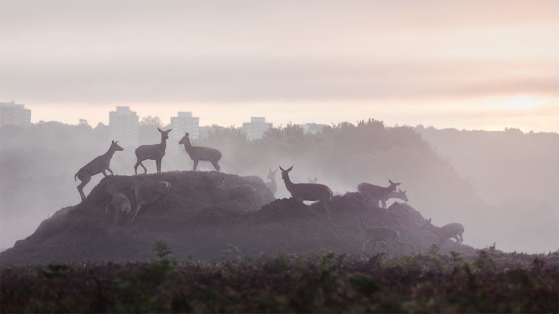
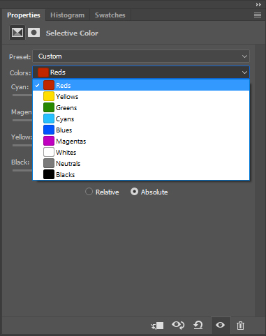
Selective Color has become one of my favorite ways to gain very precise control. I use it mostly for correcting color casts and for actual color grading. I love the level of control it provides. For the purpose of demonstration, I used Selective Color to remove the red shades in the fog, to the right of the frame and make it seem closer in color to the fog on the left side of this image. By simply heading over to the red channel and using a very basic mask, I was able to alter the color in seconds.

The benefit of Selective Color, compared to any other method, is the level of control. As a result, I find it much more enjoyable to use for color grading. Hue and Saturation is a little too basic for me in this regard and hence, is better suited to the other tasks mentioned above. By clicking on the colors drop down, we are given six color options to adjust, as well as the highlights, shadows and mid-tones (whites, blacks, and neutrals). In each one of those channels, we have full control over how much red, green, blue (plus their complimentary colors) we add or take away.
So, if I love the control of Selective Color so much, why don’t I use it all the time? Simple, it’s a little too time consuming. As you become more familiar with the tools in Photoshop, you’ll realize the limitations of each and which one is best utilized to save time. There are moments when only Selective Color will do, but usually, I revert to something a little quicker. The other reason I may opt for Hue and Saturation, over Selective Color, is the selection slider at the bottom.
Color Grading In Photoshop | Curves And Levels
And now we come to what so many would consider the holy grail within Photoshop. They kind of are, but there are so many other tools that get overshadowed by their dominance. In terms of color, I group them together as they are essentially the same with different interfaces. I prefer the layout of curves, and so I will usually work from there.
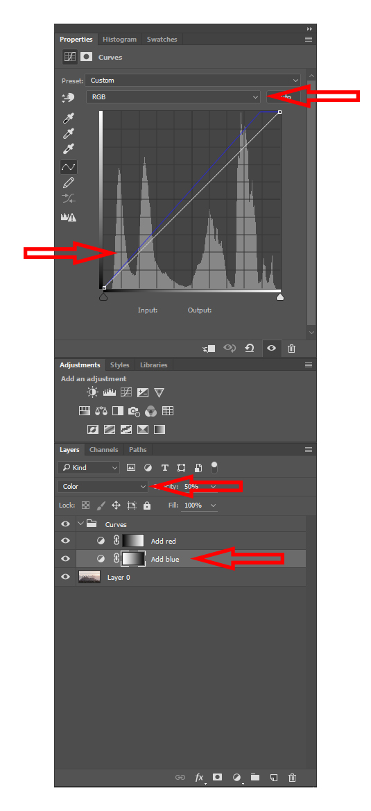
Looking at the photo above, I’ll explain it from the top down. The first arrow you see is our channel selection. Click on that drop down menu and you can edit the reds, greens or blues. Moving the line up will add the color you are working on, whereas moving it down will add the opposing color on the color wheel. For example, if we are working on the blues, up will add blue and down will add yellow.
[REWIND: A QUICK WAY TO CORRECT SKIN COLOUR FOR A HIGH-END LOOK]
The second part you must understand with curves is the histogram. All you need to know is that the right side depicts the highlights of your image, and the left shows the darks. Everything in the middle is the mid tones. Therefore, if we want to add blue to the highlights, we would move the line up on the right side. Or if we want to add blue to the shadows, we move the line up on the left side.

At first glance, Curves does appear complex, and it can take a little getting used to, but once you get your head around it, you’ll find it’s quite simple. The differences compared to Selective Color, for instance, are that we are only editing the colors within the Highlights, Shadows, and Midtones. We cannot select an actual color and alter the appearance of that throughout our photo. There is nothing wrong with that but it doesn’t give us the added control that Selective Color provides. Despite this, I often find the level of control provided by Curves is more than enough; it’s relatively fast and intuitive. Thus, I regularly utilize it for color grading images.
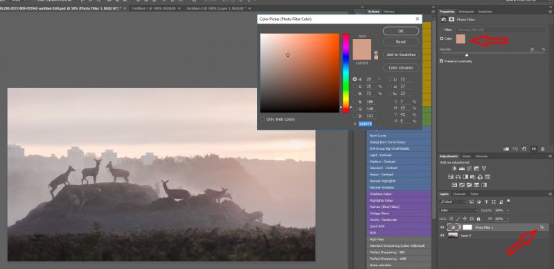
Color Grading In Photoshop | Photo Filter
I don’t tend to use photo filters very often. Nonetheless, they are another useful tool for neutralizing color casts, perhaps one of the best, and they can be used creatively in other ways.
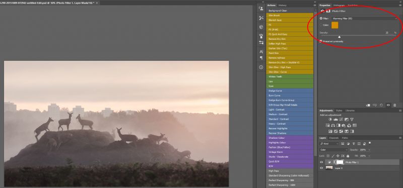
We can either select one of the presets from the filter drop down menu or choose “Color” and select our own (see photo below). Having found a colour you find pleasing try double clicking on the layer and using “blend if” to refine the area of your image the effect is applied to. Take a look at this tutorial where I talk in depth about the use of “blend if” for dodging and burning. The same method can be applied to color AND to any of the tools I have already talked about.
[REWIND: DOWN & DIRTY DODGE AND BURN TECHNIQUE USING ‘BLEND IF’]
Color Grading In Photoshop | Painting
One of my favorite methods, perhaps because it makes me feel more like an artist, is to paint color onto a blank layer using the blend mode “Soft Light.” By having the layer set to soft light, none of the detail in the image will be lost.
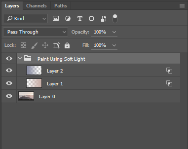
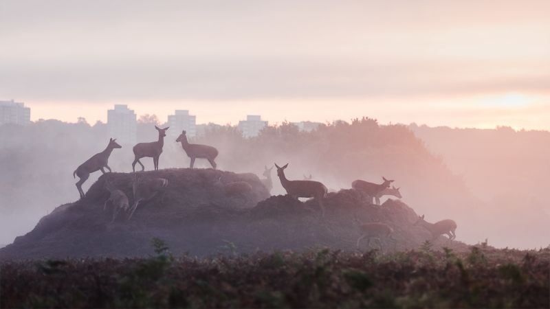
Rather than adding totally new colors, I usually use this technique to accentuate what’s already there. With this photo, I wanted to exaggerate the difference between the left and right of the frame, specifically the reds on the right and blues to the left. To do so, I selected the colors I wanted to add by using the color picker tool. I then added a little more saturation to each and applied a gradient to two separate layers so that they could be adjusted individually. Finally, I used “blend if” to refine where these colors would be present and ended up with the image below. It’s a little extreme for my taste, but as you can see, the method still produces natural looking results.
[REWIND: HOW TO REPLICATE THE COLOR PALETTE FROM ANY PHOTO OR FAMOUS PAINTING IN SECONDS IN PHOTOSHOP]
Summary
As I have demonstrated, there are many ways to arrive at the same place in Photoshop. Give each one of these tools a try and over time, you’ll come to realize which you prefer to use, and which is appropriate to use.
Comments
Post a Comment