Making a premium WordPress theme from scratch is an essential skill
for designers to learn and will become increasingly important as
WordPress continues to become the web publishing tool of choice. In this
two part tutorial will we cover how to make premium WordPress themes
happen. Part 1, covered below, shows how the photoshop mock up is
created, and in Part 2 we’ll outline how to turn the psd into HTML/CSS
and wordpress theme files.
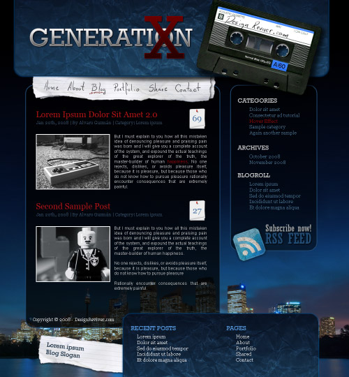
I’m Alvaro Guzman and in part 1 I’ll show you how to design a modern web interface from scratch using Photoshop and stock pictures. You can download the finished psd file at the end of this tutorial. Firstly let’s have a look at the finished psd mock up:


Also I’m adding the copyright information in this step.


I’m Alvaro Guzman and in part 1 I’ll show you how to design a modern web interface from scratch using Photoshop and stock pictures. You can download the finished psd file at the end of this tutorial. Firstly let’s have a look at the finished psd mock up:
The Finished Mock Up
Step 1
Let’s get started, first create a new blank document and draw some guides to delimite your design, 960px width is just fine, then increase your canvas size to see how it looks on wider resolutions, maybe to 1200-1260px. Do the same with the Height, start with 800px then increase the height to 1000px at least.Step 2
Now paste this image as a background, resize and place it in the bottom of our design. Create a new layer above the image then select two tones of purple-blue as foreground and background colors then go to Filter > Render > Clouds. Next apply “City” layer a Gradient Layer Mask to merge it with the clouds. Then put a black background behind the merged image and to finish the main background add another Gradient Layer Mask to the resultant image.Step 3
For the header background, draw a Rounded corner rectangle above all the layers, then apply to it a Gradient overlay effect, use the colors shown below.Step 4
Now paste this image above the rectangle, change the paper layer Blending Mode to Vivid Light and Opacity to 50%. Command (Ctrl) + Click the rectangle layer and by going to Select > Modify > Contract, contract the selection a little bit, hot Command (Ctrl) + Shift + I to inverse the selection and delete all the extra paper. You can also add some layer effects to the rounded rectangle as an Outer Glow or maybe a Stroke effect, it’s up to you.Step 5
Let’s add the logo, I’m adding the text “Generation X” (Rockwell typeface) because I’m a huge fan of 90′s culture. Then apply to each text layer the Following layer effects, just notice the Stroke color should change depending the text color.Step 6
Now draw a rounded rectangle as the sidebar background, set the Fill value to 75% and apply a Stroke effect on it.Step 7
Repeat the previous step with the content background. At this point we have the basic layout.Step 8
Now let’s add some graphic details and support images, first paste this picture of a nice cassette avobe all the layers of the design, I added some text on it using my tablet. Then select the tiny transparent plastic in the middle of the cassette, cut it and paste it just in the same place but dow its opacity to 50% or 60%. Then, merge both images and place the cassette just above the sidebar.Step 9
This is a quick trick to create shadows, duplicate the object and put it behind the original, press Command (Ctrl) + U and set the Lightness value to -100, then apply a Gaussian Blur to the copy.Step 10
Paste this paper image and put it below the header background on layers palette, this will be our navigation bar. Use the Lasso tool to extract the image.Step 11
Create a new layer above the paper, make an eliptical selection and fill it with black, then apply to it a Gaussian Blur filter and down the layer Opacity to 75%.Step 12
Duplicate the paper layer and rotate it a little bit, the apply to it a drop shadow to make it pop. Then you can add the text of your links, you can use a grunge or handwritten typeface.Step 13
Now at the bottom of our sidebar add the RSS icon, I’m using one of these icons. Also add some related text, using “Rockwell condensed” typeface.Step 14
Following just add the sidebar text, I’m keeping simple this time. “Rockwell” for the titles and “Georgia” for the links.Step 15
Then add some posts, Combine different typefaces. I’m using “Georgia” for the titles, and “Arial” for the content, also added a tiny paper sheet to put the comments over, and a support image for each post (2px white border).Also I’m adding the copyright information in this step.
Step 16
Now duplicate the technique of header’s background but this time as a footer background image.Step 17
Add the footer’s text, I’m adding two containers for Recent Posts and Pages.Step 18
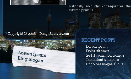
Just if you want to, add more graphic details on the footer, like this piece of paper containing a simple slogan.Step 19
An that’s it! a simple and quick way to mix grunge and modern style to design a inovative blog theme. Try your own!
Comments
Post a Comment