A few times a each month we revisit some of our reader’s favorite posts from throughout the history of Vectortuts+. This tutorial by Jonathan was first published on February 24th 2009.
This tutorial is perfect for the advanced beginner who wants to take her skills to the next level. We’ll explore how to create 3D text and use depth-of-field to enhance a design.
Want access to the full Vector Source files and downloadable copies of every tutorial, including this one? Join VECTORTUTS PLUS for just 9/month.
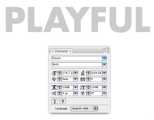
Step 1
Start by typing each letter separate so you can adjust the angle and 3D qualities of each. I’m using a font called Futura Bold. I’d recommend using a font that is not thin and delicate. The more weight the font has the better.Also, use a grey or light color so when you proceed to the next step you’ll be able to see what your 3D text looks like.
Step 2
Go to Effect > 3D > Extrude & Bevel… Enter variables where I’ve highlighted below to achieve the look indicated.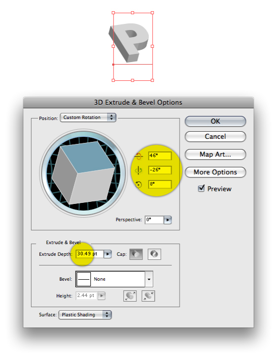
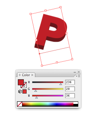
Step 3
Even after you apply 3D effects that you would like your letter to have you can also continue to rotate the letter to whatever angle you like, as I’ve done below. Just use the Selection Tool (V) to rotate the letter.Click on a color and the shading will automatically be applied to the different faces of the letter.
Step 4
Use the same technique on the other letters. Use the Swatches Palette to quickly pick a range of vibrant colors and apply them to each letter.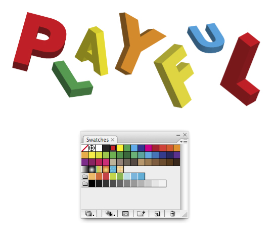
Step 5
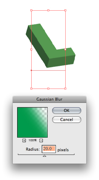
Create a depth-of-field (the appearance of objects being closer and farther away) by going to Effect > Blur > Gaussian Blur… Enter the variable below and click OK.Note: Make sure your letter will not need to be scaled larger or smaller after you apply the blur, as blur effects do not scale regardless of any preferences you have designated in Adobe Illustrator.
Step 6
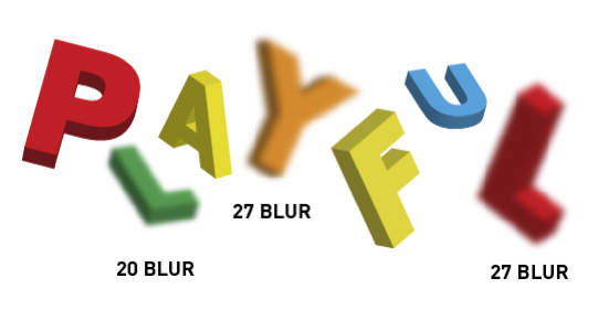
To create an even wider focal range, you can give different letters a unique blur amount.Observe how the angle, scale, blur and color all factor into how the entire word is perceived. Each letter has a random quality about it. The scale is varied to suggest distance. Again, the blur reinforces the depth and the colors are all bright and not repeated next to each other.
Step 7
Type the rest of the phrase. The font I’m using is Bickham Script. As you can see, the font is very different from the font that the word "Playful" is written in. This creates a nice range and contrast between the two. Do the same for your layout.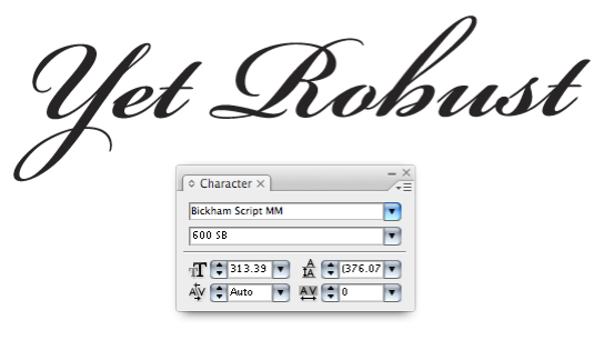
Step 8
Using the Rounded Rectangle Tool to draw a rectangle as shown below.Note: You can adjust the curvature of the corners by holding the up or down arrow while you draw the shape.
Step 9
Fill the rectangle with a 3-point gradient. The right-most green color helps create a slightly darker green that will frame the rectangle even more.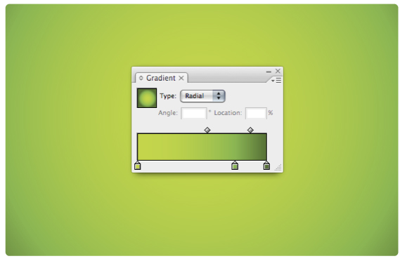
Step 10
Move the text over the background. In order to apply a gradient to the text you will first need to turn it into outlines. Go to Type > Create Outlines. Now, select the text and give it a subtle grey to white gradient.
Step 11
To make the text look even more 3D add an Inner Glow by going to Effect > Stylize > Inner Glow… Select Screen, in the Mode drop down. Enter about 75 for Opacity and set the blur to your liking.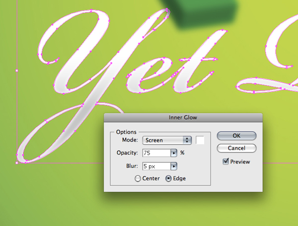
Step 12
Now that the letter looks somewhat rounded we’ll take it a step further and add a drop shadow. Go to Effect > Stylize > Drop Shadow… Set the Mode to Multiply (so the shadow blends nicely with the background). Set your Opacity to about 20 and give it a blur of your choosing.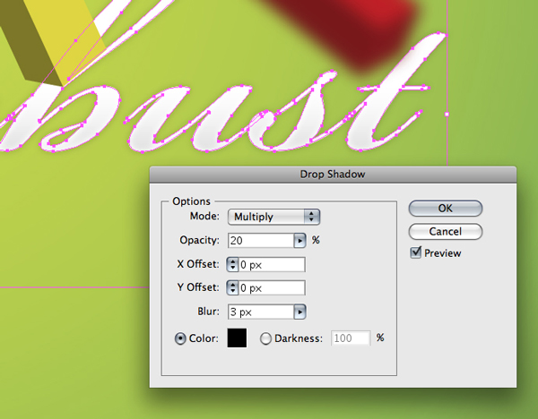
Step 13
This is what your design should look like right now.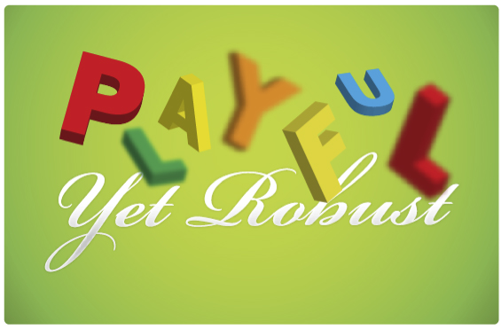
Step 14
We’ll give certain faces of each letter an enhanced look by giving them gradients. First, make a copy of the letter. Select the copy and go to Object > Expand Appearance. Now go to Object > Ungroup. Continue to Ungroup the object until you can select the face of the object.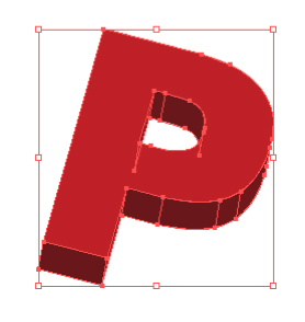
Step 15
Select the face of the letter and give it a moderate red to dark-red gradient.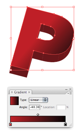
Step 16
You can now delete the leftover parts of the letter that you did not apply a gradient to. Place the face of the letter over the letter with the 3D effects applied to it.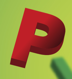
Step 17
Use this same technique to create depth on any other letters that need it. For instances where the letters are blurred simply apply the same blur to the face of that letter. To see how much blur a letter has double-click on that effect in the Appearance Palette.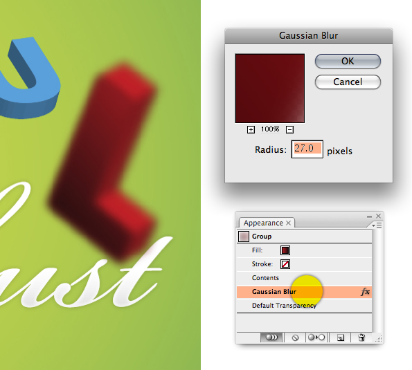
Step 18
Next we’ll give the background a random circle pattern. Draw a circle using the Ellipse Tool (L). For the purposes of this tutorial I’ve used a black circle but your circle should be white, or whatever color you want your pattern to be. Drag the circle into the Brushes Palette. The dialog in the next step will open…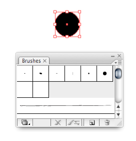
Step 19
Select New Scatter Brush and click OK…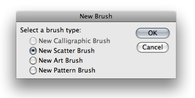
Step 20
Select Random for Size, Spacing and Scatter. Next, drag the small triangles to both sides of the slider for all three options. This will ensure the circle pattern is varied and not too repetitive. Click OK.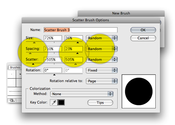
Step 21
In the Brushes Palette select the circle brush you just created. Select the Paintbrush Tool (B) and draw an arbitrary line. Your line will be replaced by a circle pattern similar to the one below. If your circles are not as random as you like, just double-click on the circle in the Brushes Palette to change the parameters.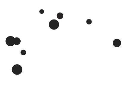
Step 22
Place the circles on their own layer behind the letters. Feel free to draw more lines or copy and paste the other circle pattern to build a mass of circles.
Step 23
Using the Ellipse Tool draw a circle and give it a Radial fill with a 3-point gradient. Using 3-points will allow you to give the circle an extra highlight that will add to its realism. Copy and paste this shape a few other times throughout the layout.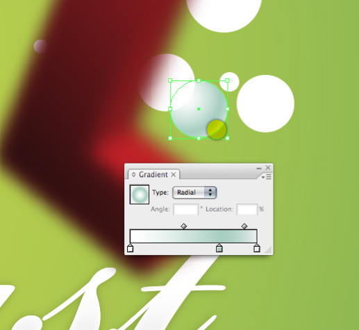
Step 24
You can create other brushes using different shapes like squares, triangles and outlined versions of each shape to keep things interesting.
Step 25
Using the Pencil Tool (N) draw some erratic shapes that will function as moss or general greenery on the letters.When you’re drawing with the Pencil Tool it’s sometimes difficult to close the shape. The easiest way to close a shape is to hold down the Option key when you are nearing the starting point of the shape. This will automatically close the shape.

Step 26
Add other assorted shapes and give them a green to dark-green gradient.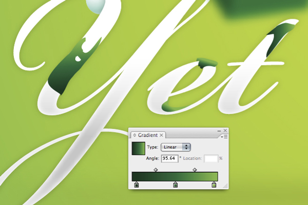
Step 27
To make vines I’ve simply used one of the alternate characters that was included with the font Bickham Script. If your font does not have alternate characters you can try using parts of other letters, like an S for example. Otherwise you will need to draw some curly shapes the old fashioned way… using a Wacom Tablet and the Pen Tool.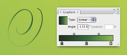
Step 28
Create a leaf shape in much the same manner that you did for the moss shapes. You’ll get better at drawing shapes the more you practice.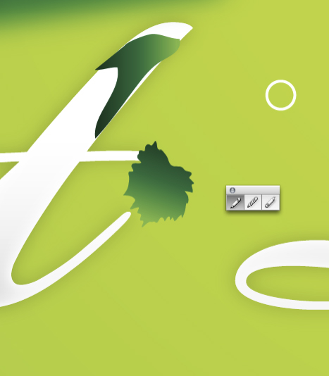
Step 29
To amplify the look of the leaf give it an Inner Glow by going to Effect > Stylize > Inner Glow…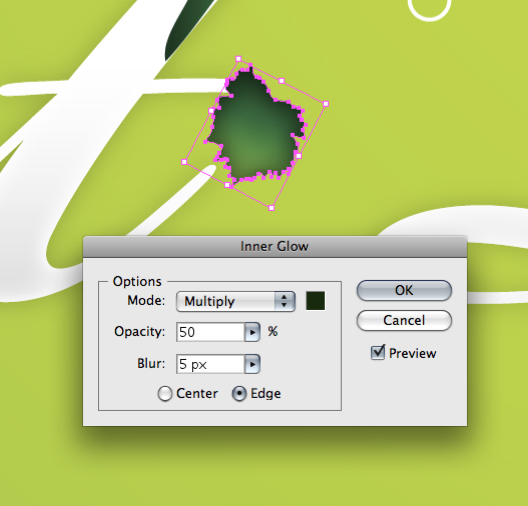
Step 30
This is what your layout should look like right now.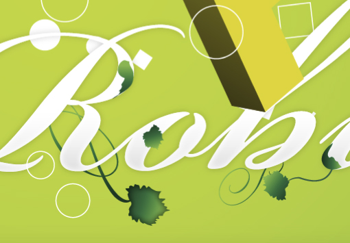
Step 31
We’ll give the background a bit of motion by using the Pen Tool (P) to draw a shape similar to the one below.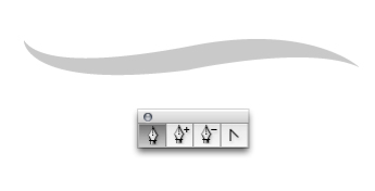
Step 32
Duplicate the shape a couple times and adjust the Opacity to lessen the appearance of the shape. Give some of the shapes a tenuous blur to again create the illusion of some of the swooshes being farther away.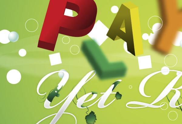
Step 33
Using the Rectangle Tool, draw a rectangle and give it a 4-point gradient with white being on both ends.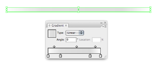
Step 34
Place the gradient over the background and give it a blur. In the Transparency Palette set the shape to Multiply, so it blends well with the background. Feel free to also adjust the Opacity if need be.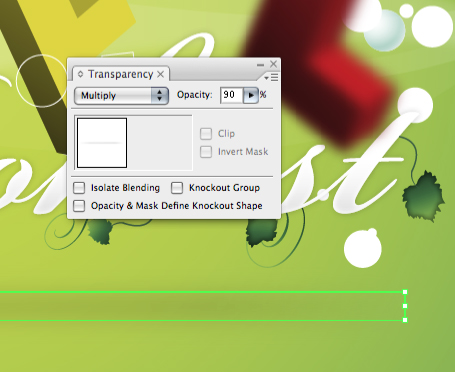
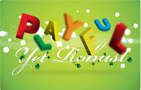
Final Image
Here is the final image. You’ve just learned how to create a vector 3D letter design. Cheers!
Comments
Post a Comment