The End Design
It’s quite an elegant design, which would probably suit a designer portfolio-type site, but really could be altered for all sorts of purposes. It relies on having elegant typography, a structured layout, and a visually interesting background.The real power of this design is to show you what can be accomplished by keeping it simple. At the end of this Photoshop part of the tutorial, I’ll show you how we can easily swap backgrounds and fonts and explain why this design works well.
It’s a simple structure: horizontal menu, main heading panel, and content area. Although this is a homepage design, you could imagine an interior page would simply have a different heading panel and new content area. For the purposes of simplicity, we’ll only be putting together the homepage design.
Step 1
First of all, create a new document. Mine is 1100px wide x 1100px high. This is so that I can create a Web site made for 1024px wide, but still have space to decide what is going to happen outside the viewable area so that it degrades nicely even on larger screens.Now our first task is to create a nice abstract background. To do this we’ll draw a linear gradient down using these two colors: #1b204c to #472373.

Step 2
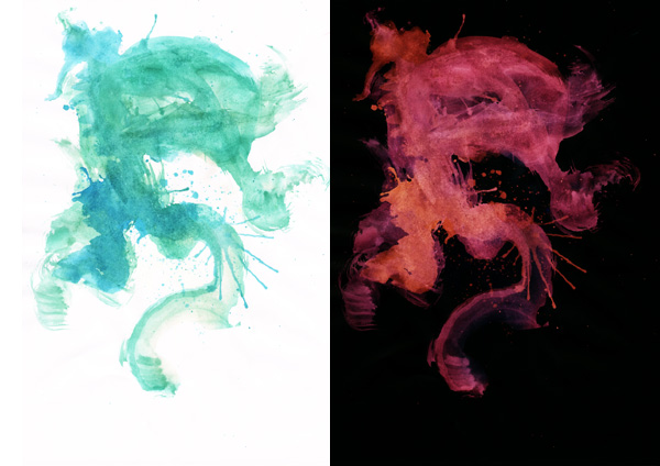
Now we want a visually interesting background which is abstract enough that it doesn’t distract from the text. Fortunately, there is an awesome watercolor image available free via GoMedia’s Arsenal, click on the freebie section and you’ll find two watercolors; the one we want is the greenish one.Now while it’s very pleasant as is, it’s much cooler if we press CTRL+I and invert it so it’s that nice pink/purple on black.
Step 3
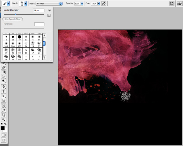
Now copy the watercolor onto our main canvas and press Ctrl+T to transform it down to a reasonable size. Our aim here is to have it fade to black on the right (so that we can build our HTML later with greater ease). Additionally, we don’t want it too long vertically, either, so it’s best to erase a little of the excess. To do this grab a paint brush and paint in black to just remove the bottom parts.Note that it’s best to get a brush that has some texture so it’s not obvious that we erased parts. If you scroll down your brush list, there is a brush that comes with Photoshop that looks like the one shown. It’s not a bad brush to use. Of course, you might have some even nicer paint brushes and feel free to use those.
When you’re done, fill in any areas on the right and bottom with black so that the whole canvas is covered by this layer.
Step 4
Now decrease the opacity of the watercolor layer to about 70% and set its blend mode to Overlay. That way, some of the coloring passes through to create a nicer look.
Step 5
Now in a new layer above the watercolor layer, and drawing straight up, make a Linear Gradient going from black to transparency so that afterwards your canvas basically fades to black down the bottom.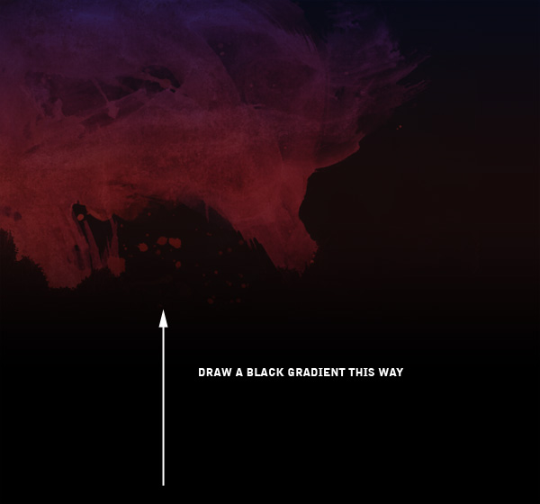
Step 6
Next in two new layers, draw a couple of Radial Gradients from white to transparency, one larger than the other. Set these to Overlay and 40% and 100% Opacities for the larger and smaller ones respectively.Basically, you should be making a highlight on our image to give it a bit more texture.

Step 7
So here’s the finished background. It’s dark, abstract, and quite elegant with the coloring. Of course, pink might not be your particular choice of color usually, and if that’s the case, feel free to add a color adjustment layer on top and use it to adjust the coloring. I kinda like the pink/purple, so am going to run with it!
Step 8
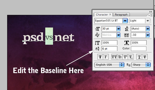
Now we create a new layer and add a "logo". I don’t really have a purpose with this design, so I decided just to put some text in and pretend that’s my logo. Because this tutorial is half Psdtuts+ and then half NETTUTS, I wrote out a neat little "psd vs net".The fonts I’m using here are Egyptian505 BT Bold and Egyptian505 LT BT Light (the lighter version of the font is what I’ve used for the ‘vs’).
To make the ‘vs’ bit raise up a little you can use the baseline control in the Character Palette (shown in the second image below).
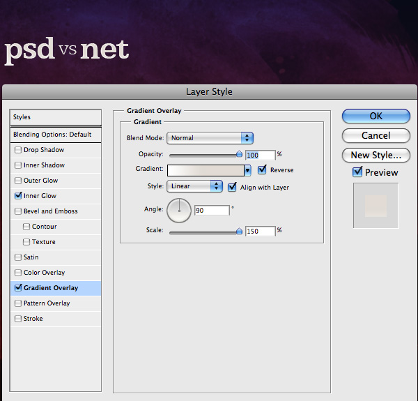
Finally, I also added a little layer style to the text with a faint Gradient Overlay as shown and a 1px Inner Glow with white.
Step 9
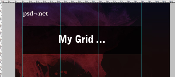
Now at this point, I switched on my Rulers (Ctrl+R) and drew a couple of guides. I divided my page into three columns with lines at 50px, 320px, 610px, 900px. At least those are the numbers I should have used. Looking at my screenshot I just realized my third line is off … d’oh!Anyways, the point is that I’m defining the space I’ll be placing all me elements in, and if I were to make multiple pages I could use this grid in different ways. As it is, with only the homepage being designed, I’m just going to use those three columns once—a little later on.
Step 10
OK, so now we draw in our first black box. With your rulers and guides still on, create a new layer and draw a Rectangular Marquee (M) going from one side to the other. Fill it with black, then set this layer to 80% Opacity, right-click the layer, and choose Blending Options. Then click on Stroke and add a 1px white stroke on the Outside and set to Overlay. This will give us a really cool border that will make the box look much sharper.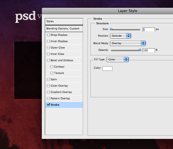
Step 11
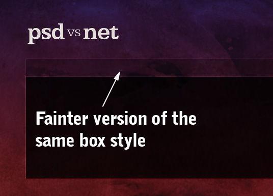
Now duplicate the box layer, and using Ctrl+T, transform the box so that it’s the same width but much shorter (as shown below). This will be our navigation box.Change the Opacity to 40% and the Fill to 50%. This will make our box much fainter and give some depth to the two boxes, making one seem more important and imposing than the other.
Step 12
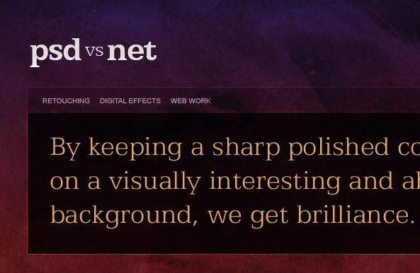
OK, now we add some text. Again I’ve used Egyptian Light here for the big headline copy (that will be an image in the final HTML) and Arial for the menu items (that will be HTML text links).Now a word on typography. This design relies heavily on the fact that we’ve used a simple, clean typeface. Having the text nice and large makes it appear very bold, but at the same time because it’s a very thin typeface, it comes out looking elegant.
If you’re looking for a high-end design look, thin, classic typefaces are hard to beat. When I first discovered Helvetica Ultralight, I remember I went crazy designing all these designs that looked really minimal and up-market.
Additionally, this particular font—Egyptian—has a very sharp, slab serif, combined with a sort of squarishness that makes it look quite cool (I think).
There are plenty of other awesome fonts you could use. As a general rule though, you want something more classic looking. Or in other words, unless you know what you’re doing, you’d want to stay away from really weird looking fonts—e.g. something that looks very futuristic. Actually as a good, general rule, unless you’re super confident, it tends to be better to veer towards more ordinary fonts.
Another kind of typeface that would work really well here is something that is a a bit technology-looking like this font that Chris Garrett Media uses. I have no idea what font that is, or what that type of font is called, but it’s pretty neat. Maybe a kind typophile might illuminate us in the comments :-)
Step 13
Anyhow, after seeing Chris Garrett Media‘s site, I decided it would be pretty cool to add a gradient overlay to my type and give it a bit of a shine. So as you can see below, here we’re adding a Gradient Overlay from black to white, faded out a bit and on Overlay mode.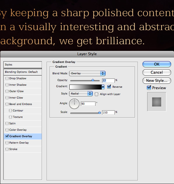
Step 14
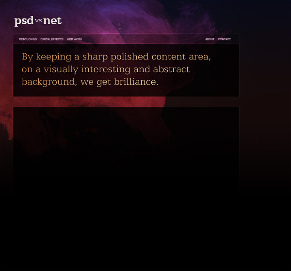
Now we can draw an additional big black box for the content area. Actually, you can just duplicate the earlier layer and transform it again.And that gets us to the point shown in the image below. Looking pretty cool!!
Step 15
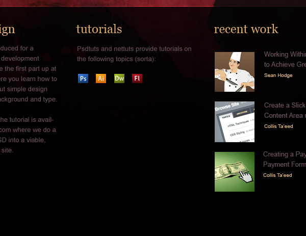
Now we add a bit of dummy content in the content box. Here I’ve again used Arial for most of the text, but for the headings rather than use Egyptian, I’ve gone with Georgia. Georgia is not quite as elegant, but is a standard font which means I can make these headings in plain old HTML instead of relying on images (or Flash).Actually, with Windows Vista’s release there is also another semi-standard font that would work well here called Cambria. But Cambria has some weird rendering problems in Firefox on Macs at certain sizes, so we’ll stick with good ol’ Georgia for the moment.
Step 16
Finally, I created a new layer at the bottom, filled it with a dark purplish color, added a 1px border to the top, and voila we have a footer.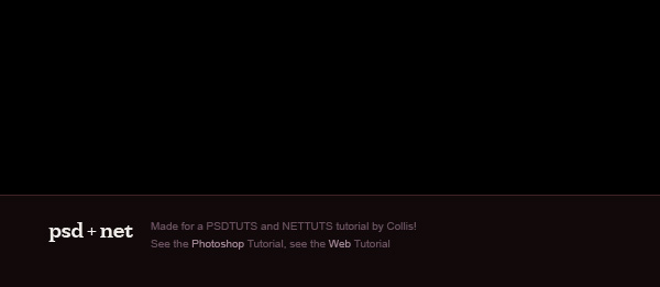
Ready for Building
Putting it all together, the site is ready to build.Alternate Background 1
Now one of the cool things about this design is we can easily swap the background and the design still looks awesome. Here’s I’ve swapped it for an image from with a similar color scheme. It’s a very cool 3D rendering of light, and like our current background, it is also abstract and visually beautiful.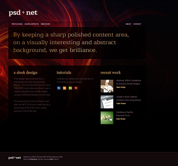
Alternate Background / Colours 2
Here I’ve used another abstract image from Because the color has changed, I’ve also gone through and amended the colors in a few places—particularly the text—and also added a big glow to the main copy.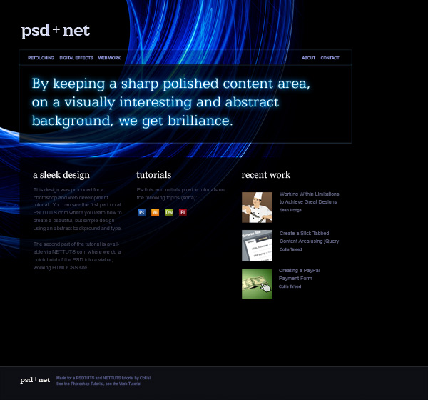
Why it Works
Now it’s unlikely you’re ever going to have need of this exact design—now that I’ve written a whole tutorial on it. So let’s talk a little about why it works well, because that will help you use the principles to create your own unique look.There are several things that come together to make a design that works here:
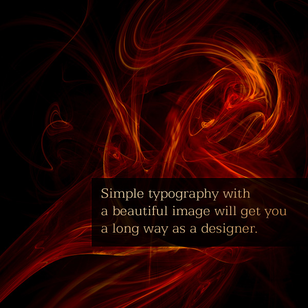
- First, I’ve picked really stunning backgrounds. The ones from iStock and the one from GoMedia would make nice images all by themselves. They are interesting to look at but they don’t fight for dominance. They also all fade out really easily. Photos that fade out easily are always easier to work with.
- Great images are the perfect partner for simple and clean typography. Because the images are so lovely, you don’t need to do overdo it with the typography. It can just be clean, clear, and organized.
- Another factor that goes into making this work is that there is plenty of space. With a complicated background, it would be easy to wind up looking cluttered. So it’s important to make sure there is plenty of space between things, and inside the boxes, and so on. Space also is a great way of making a design look more high-end. Nothing screams low-end like clutter.
Now the HTML/CSS
Now enough of this nambi-pambi Photoshop stuff, let’s go do some HTML/CSS! Follow on to the second part of this tutorial where we build our design into a working Web site over at


Comments
Post a Comment