RGB document

Step 1

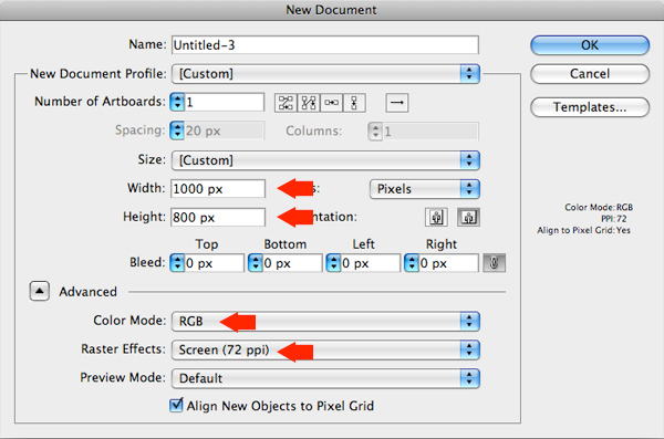
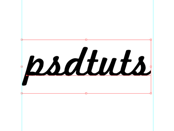
Open Illustrator and create a new RGB document, 1000px by 800px, 72 DPI, and write your text in a nice big font. I’ve used Marketing Script size 234pt.
Step 2

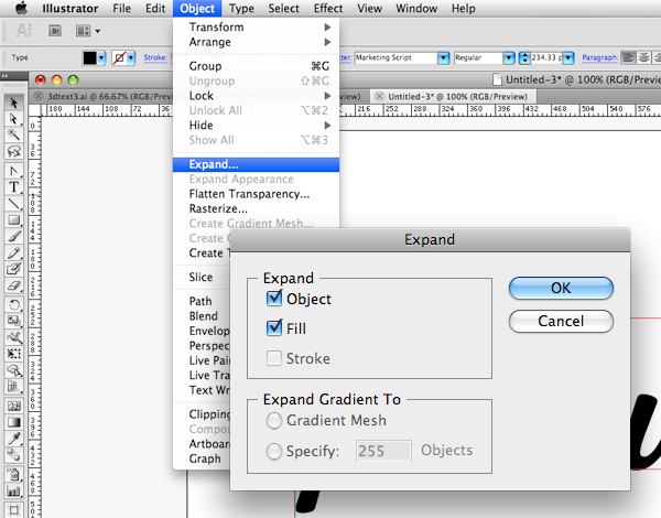
Next, with you text selected, go to Object > Expand, and hit ok on the pop up window. Our text is no longer editable as text, instead it’s a series of paths that we can edit with the direct selection tool.
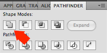
Currently, our letters are separate objects grouped together, we want them to be one single compound path. We can do this using the Unite button on the Pathfinder Palette. If you don’t see the Pathfinder Palette, go Window > Pathfinder to show it, and with our paths selected, click Unite.

Step 3

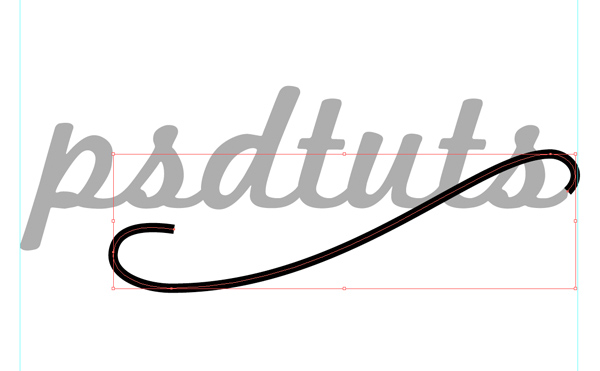
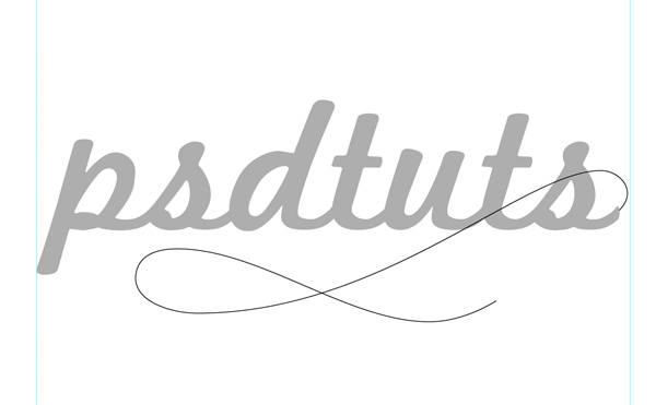
With the Pen Tool (P) selected, draw a new path starting from the last flick of the last letter s, and swirling its way down underneath our type. I’ve also changed the color of the text to a lighter grey just so I can see what I’m doing better.
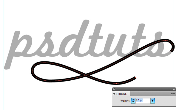
Change the Stroke Weight of our new path to a size that matches the width of the text path that it will be joining. In my case the Stroke Weight is 12pt.

Step 4

Duplicate this path by dragging the Group’s thumbnail (in the layers palette) to the New Layer button. Switch off this duplicate by clicking the ‘eye’ next the group thumbnail in the Layers Palette. We’re doing this because wherever our elements overlap we need them on separate layers in Photoshop for when we add shading.
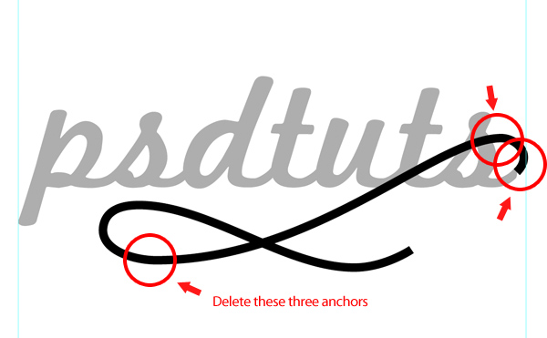
With the Direct Selection Tool (A) select the two bottom-right Anchor Points of our path, hit Delete and name this group "swirl 1".
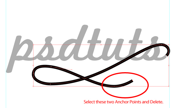
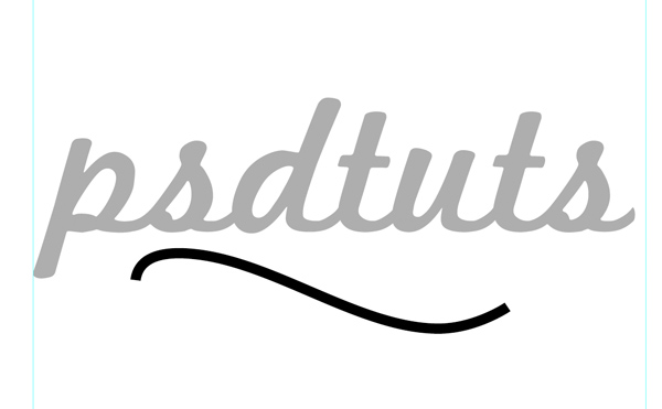
Turn this "swirl 1" group off and turn on the duplicate that we made, name it "swirl 2" and delete the following Anchor Points. We’re doing this because when we extrude our shapes into 3D, we don’t want our paths to intersect, we want one to pass in front of the other.

Step 5

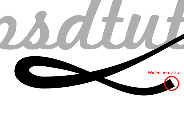
Switch all our groups back on now and you should have the complete original path, only it’s broken up onto two different groups. With both of these Groups selected go to Object > Expand, and press OK on the pop-up window. Now we want to make our swirl a bit more interesting by adjusting the width in certain places. To do this we’re going to zoom in and move some Anchor Points manually.
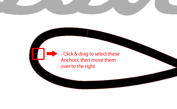
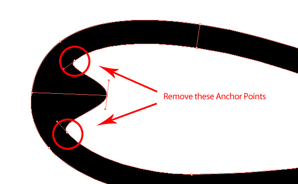
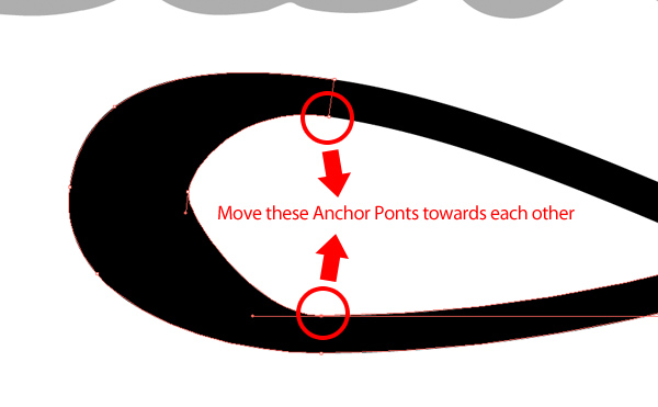
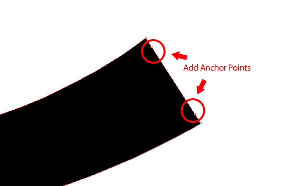
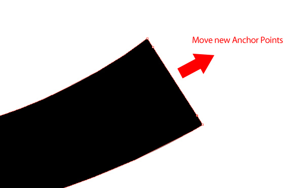
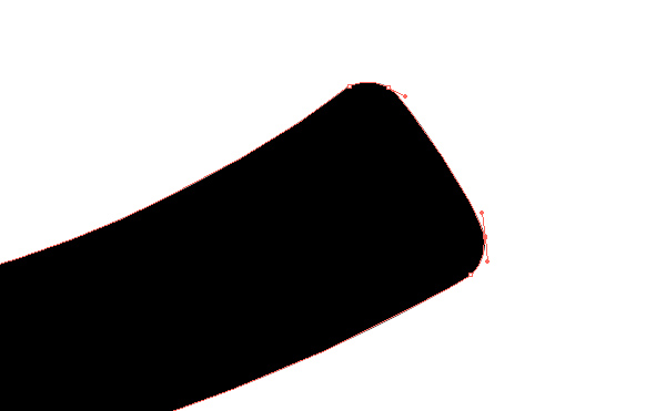
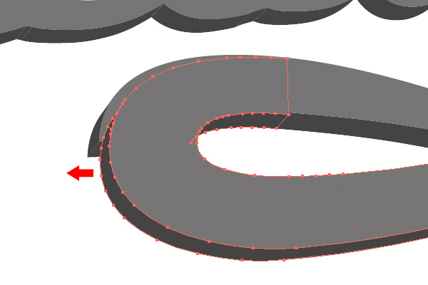
Now zoom in to the end of our swirl and add two Anchor Points as shown below, then move them slightly up and to the right.
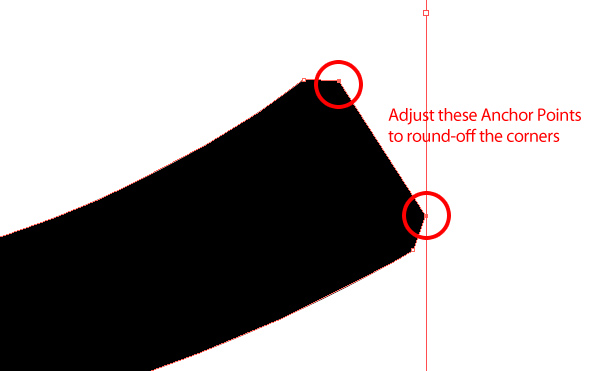
Now with the Convert Anchor Point Tool (Shift + C), adjust the two new Anchors to round off the corners.

Step 6

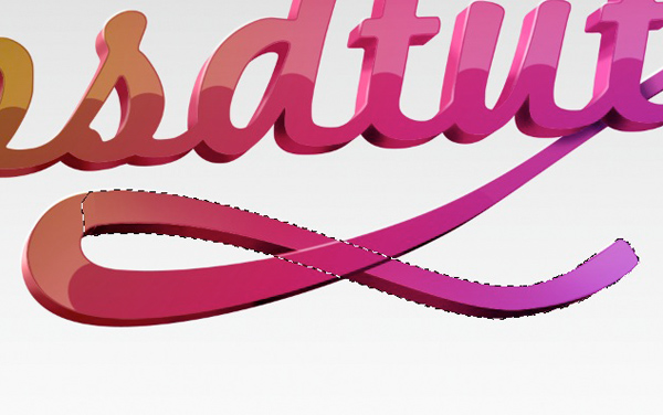
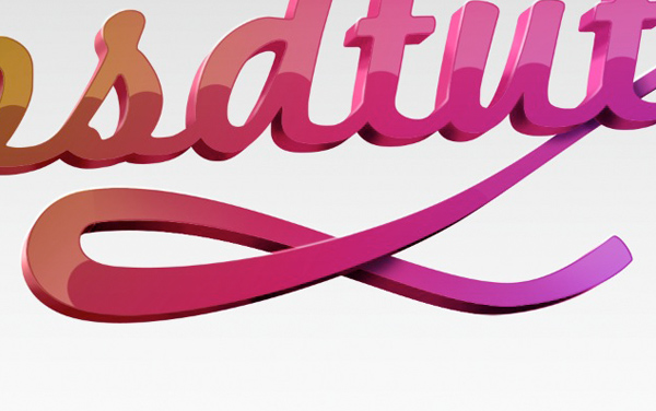
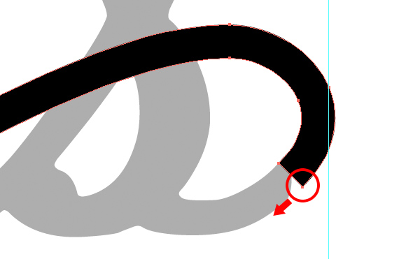
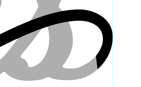
Next we need to tidy up the area where our text will join our swirl. Zoom in to that area and adjust the swirl path so it flows out nicely from out text
Step 7

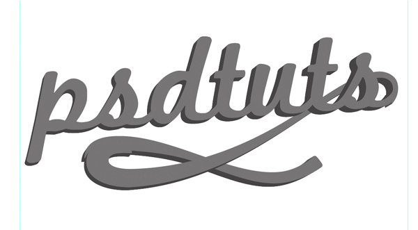
OK, before we Extrude this shape, this is your last chance to adjust your swirl so now’s the time to make any final tweaks, it’s worth spending the time here to get your line work just right. When you’re happy with your design, change your object so they’re all the same color, a medium grey, then with all of them selected go to Effect > 3D > Extrude & Bevel.
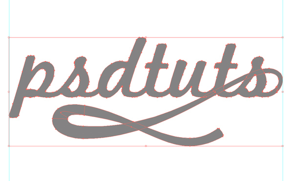
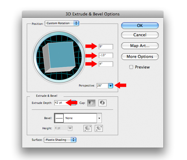
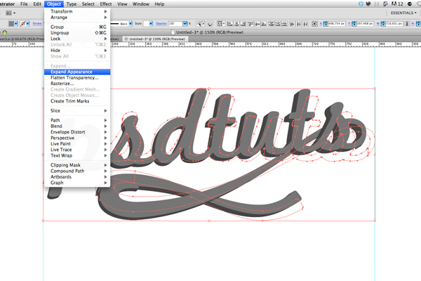
Then with all our objects selected, go to Object > Expand Appearance.
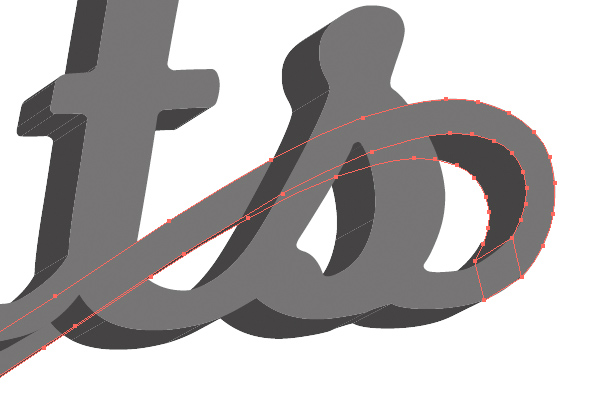
You’ll notice that in some areas our objects don’t quite line-up as they should, reposition them slightly now, but you wont be able to get them perfect yet, that will take a bit of path editing, we’ll do that in a moment.

Step 8

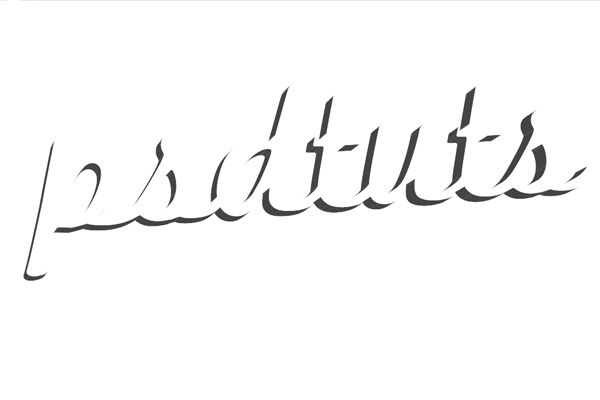
Now turn off the two swirl layers, so you’re just left with the text. Select the text and Right-Click > Ungroup, then once more, Right-click > Ungroup. Now select the front surface of our text, and turn off this layer. You should now be left with the darker 3d elements.
Click and drag to select all of these remaining elements then click the Unite Button in the Pathfinder Palette and name this group "3d 1". If you don’t see the Pathfinder Palette, go to Window > Pathfinder. Uniting these objects joins them all as one Compound Path; it should also get rid of those little white lines. Repeat this process for the two elements that make up the swirl, naming then "3d 2" and "3d 3".
Step 9

You should now have six groups –
"text", "3d 1", "swirl 1", "3d 2", "swirl 2" and "3d 3"
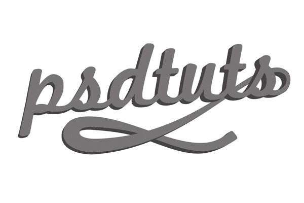
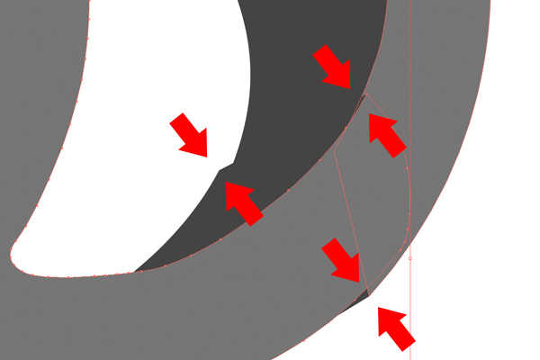
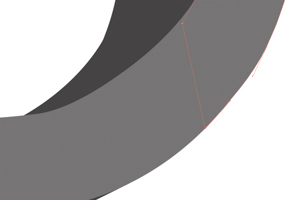
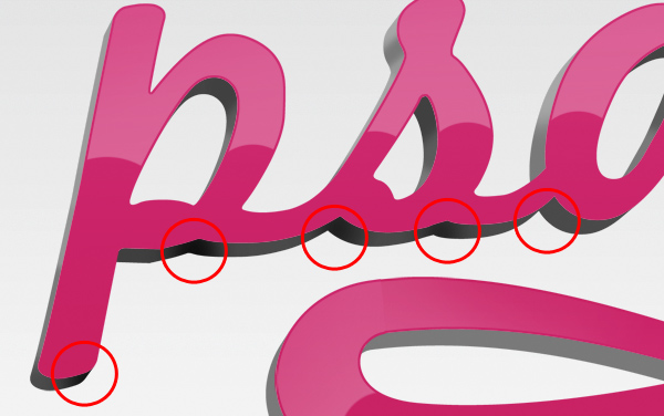
Before we export this file to Photoshop, we just need to clean up the line work around where our text meets "swirl 1". Zoom in on that area with the Direct Selection Tool (A), edit the Anchor Points and their Handles to make the two seamlessly join together.
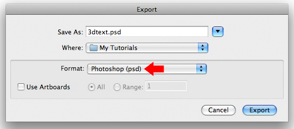
Now we’re ready to export this file to Photoshop as a Layered PSD. To do this go to File > Export and make sure you select Photoshop as the Format.

Step 10

Open the exported file in Photoshop and go Image > Canvas Size and enter 3000 x 2000px and press OK. Resize our layers (Cmd/Ctrl + T) while holding Alt + Shift, make them a comfortable size within the document.
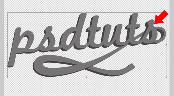
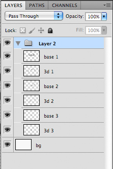
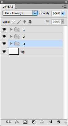
Name and arrange your layers as follows, so we have three “base” layers (these are the light grey layers that make up the front face of our object), and three “3d” layers (the darker grey 3D elements).
Now group (Cmd/Ctrl + G) our three pairs of layers into individual groups named “1″ “2″ and “3″, so “1″ contains our text layers (“base 1″ and “3d 1″), “2″ contains “base 2″ and “3d 2″ and “3″ contains “base 3″ and “3d 3″.

Step 11

Create a new layer and place it below group "3", name it "bg" (for background) and fill it with white. Then create a new layer on top of "bg" and name it "bg2". Set your foreground color to grey #767676 and select the Gradient Tool (G). Choose a foreground to transparent gradient and draw our gradient from the top of the document down to the middle and set the layer transparency down to 30%.
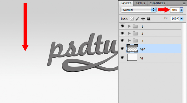
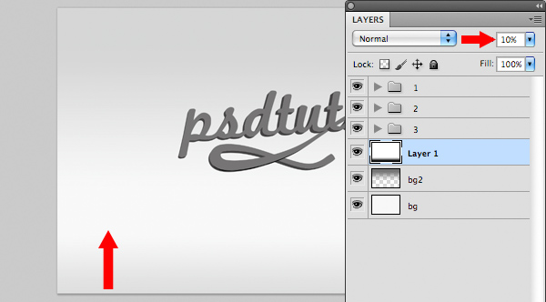
Create a new layer on top of "bg 2" and name it "bg 3". Select the gradient tool and press D to set our foreground and background colors to black and white. With a foreground to background gradient selected draw a new gradient at the bottom of our document and change the layer to 10% Opacity. Group these three new layers and name the group "background".

Step 12

Now select “base 1″ layer and apply a Gradient Overlay Layer Style (Layer > Layer Style > Gradient Overlay) using colors #c81d61 and #d3347b.
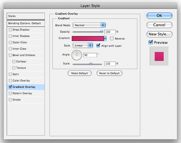
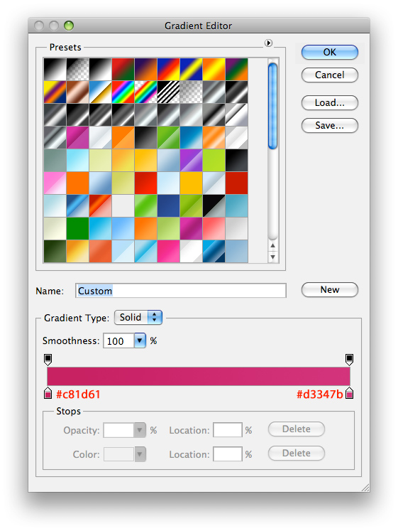
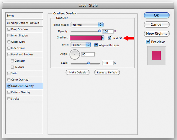
Right click on "base 1" layer and select Copy Layer Style. Now select "base 2" and Cmd/Ctrl + Click on "base 3" so we have both layers selected, then right click on of the two and select Paste Layer Style. Double click on the Layer Style of "base 3" to open the Layers Palette and Reverse the gradient.

Step 13

Now we’re going to add a simple Color Overlay Layer Style to all our “3d” layers. Select “3d 1″ and apply a Color Overlay (Layer > Layer Style > Color Overlay) and use color #797979. Then copy this Layer Style (Right click > Copy Layer Style) and then paste it to “3d 2″ and “3d 3″.
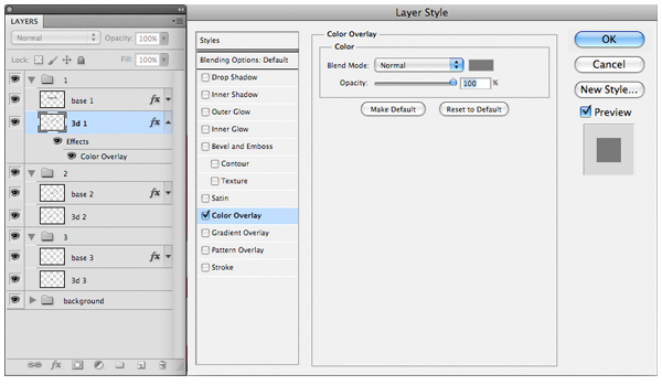

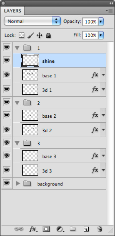
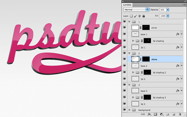
Now create a new layer within group “1″ and name it “shine”. Our layers should now look like this.
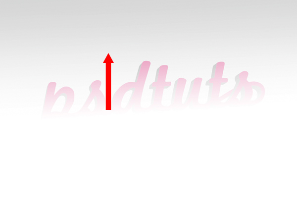
Set white as your foreground color, select a foreground to transparent gradient and draw this gradient from the middle of the document up to the top of the text.
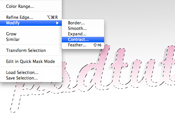
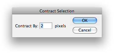
Cmd/Ctrl + Click on the “base 1″ layer thumbnail (this will load a selection based on that layer) then go to Select > Modify > Contract and use 2px as the amount.
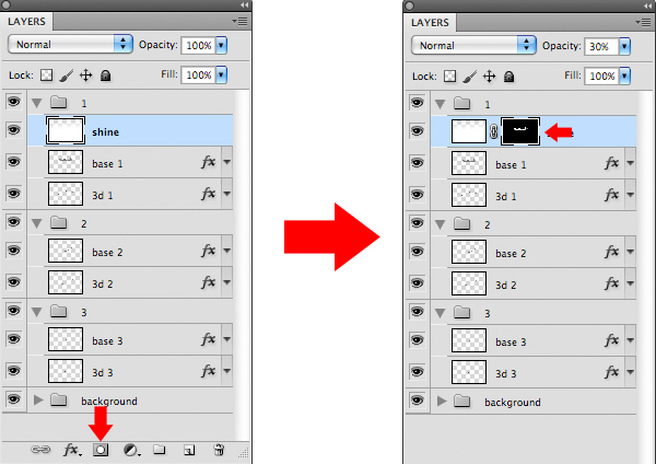
Set this "shine" layer to 30% Opacity, then with this selection active and with our "shine" layer selected, click on the Add Layer Mask button located at the bottom of the Layers Palette.

Step 14

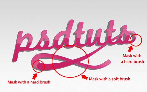
Now with the Layer Mask selected and your foreground color set to black, take a medium sized, hard edged brush and mask out more of the “shine” layer.
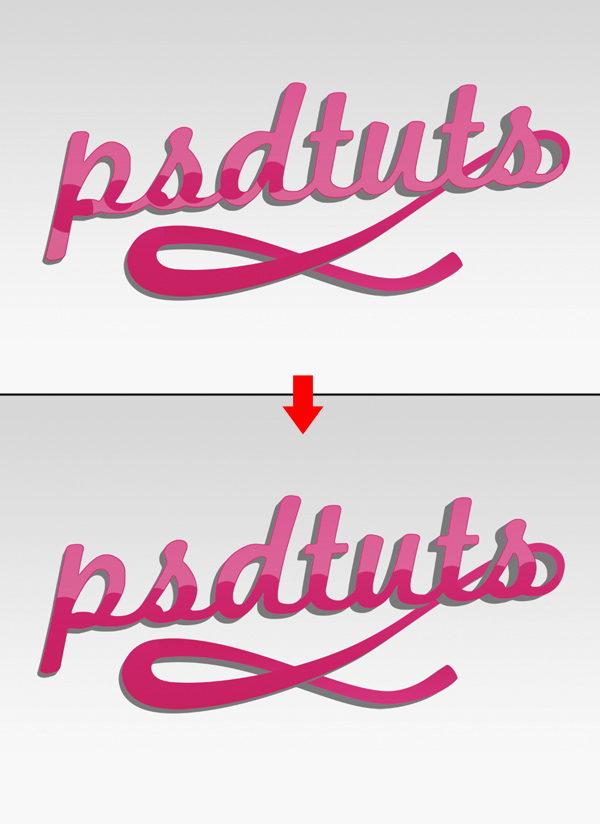
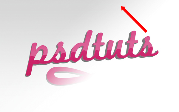
Create a new layer called “shine” and place it in group “2″ and draw another white to transparent gradient this time in a diagonal direction.
Cmd/Ctrl + Click on the layer thumbnail of "base 2" (to load a selection based on this layer) then Cmd/Ctrl + shift-click on the layer thumbnail of "base 3" (this will add a selection of "base 3" to our current selection). Once again we need to contract this selection by 2px, we do this by going Select > Modify > Contract > 2px. With our new "shine" layer selected, click the Add Layer Mask button in the bottom of the Layers Palette again to apply our selection as a mask. You should have something like this.
Turn this new “shine” layer down to 50% Opacity and then with a variety of hard and soft edged brushed, we’re going to mask more of this layer.

Step 15

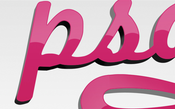
Create a new group within group “1″, name it “3d shading” and place it above layer “3d 1″ and below “base 1″. Now Cmd/Ctrl + Click on the layer thumbnail of “3d 1″ and click the Add Layer Mask button to apply the selection to the new group as a mask.
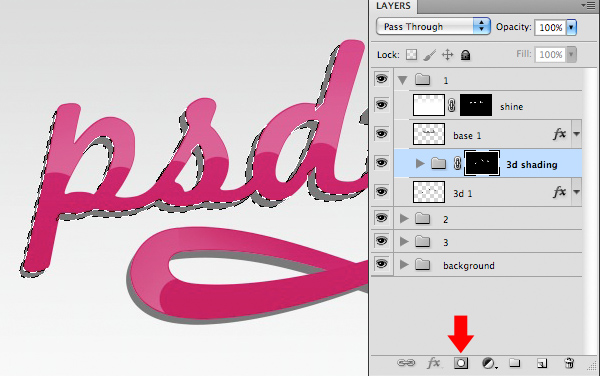
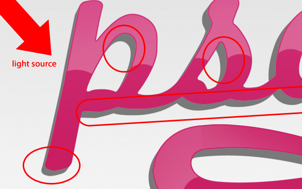
Create a new layer inside this new group and name it “shading 1″, then with a small soft brush set to 80% black, shade in any areas that would be in shadow according to your light source.
Then set the layer’s blend mode to Overlay, 50% opacity.
Create a new layer above “shading 1″ and call it “shading 2″, then with a small soft brush set to white and 50% Opacity, paint any areas that would be lit up by our light source.
Set “shading 2″ to 50% Opacity with Blend Mode – Overlay.
Create a new layer in this group and name it "shading 3". Then with a small, soft black brush set to 100% Opacity, paint more shadow in the small areas along the bottom of the text that would be receiving no light.

Step 16

Now we’re going to repeat this process for group “2″. Within group “2″, create a new group above “3d 2″ and below “base 2″, name it “3d shading 2″, then Cmd/Ctrl + Click on the thumbnail of “3d 2″ and apply that selection as a mask to “3d shading 2″. Then create a new layer called “shading 1″ within this group and with a medium sized, soft black brush paint in some shadow. Lastly, change the Blend Mode to Overlay.
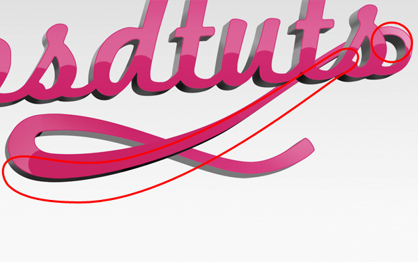
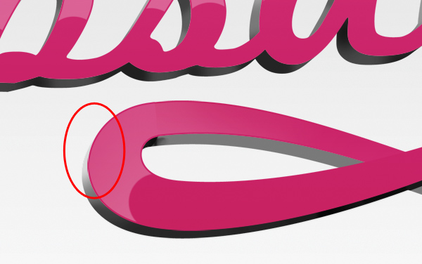
Create a new layer in this group and call it “shading 2″. With a medium, soft, white brush, paint a highlight on the left corner and change the layer’s Blend Mode to Overlay.

Step 17

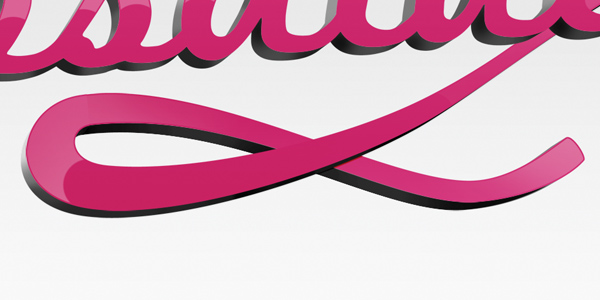
Now we’ll do the same for group “3″. Create a new group called “3d shading 3″ and place it in group “3″ between layers “base 3″ and “3d 3″. Cmd/Ctrl + Click on layer “3d 3″ and apply the selection as a mask to “3d shading 3″. Create a new layer called “shading 1″ within this new folder and set the Blend Mode to Overlay. With a large black brush paint some shadow along the bottom edge.
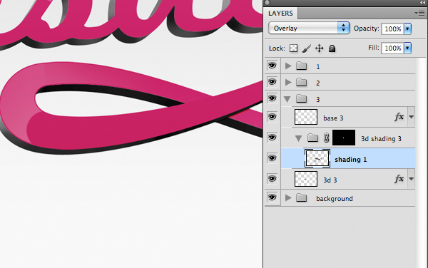

Create a new layer called “shading 2″ and with a large white brush paint a highlight as follows.
Switch the Blend Mode to Overlay.
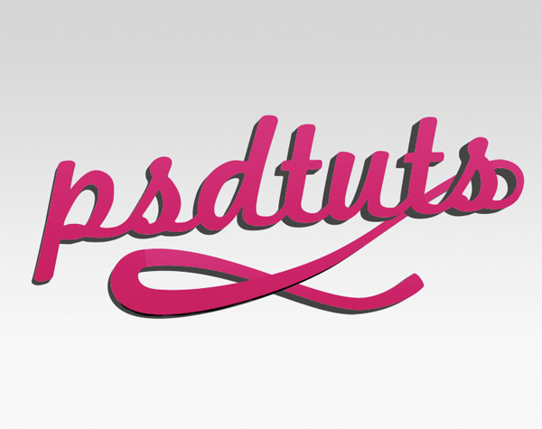
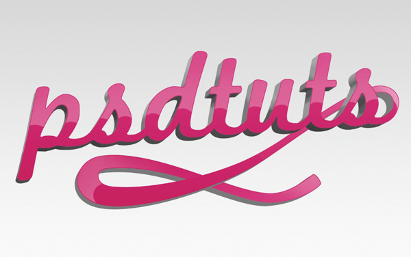
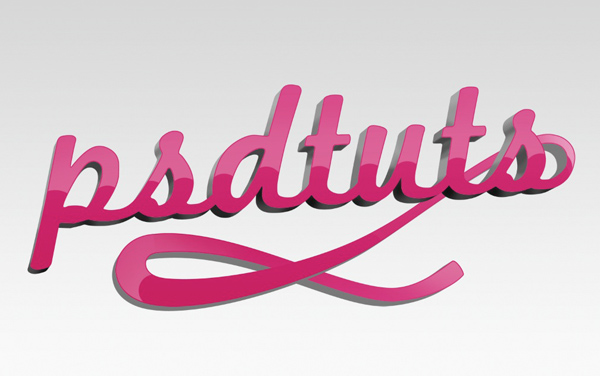
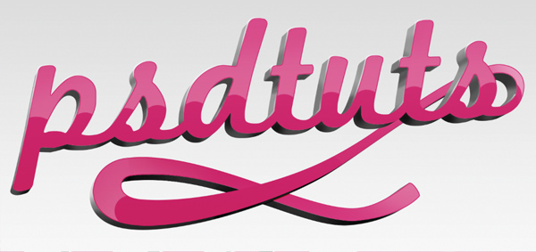
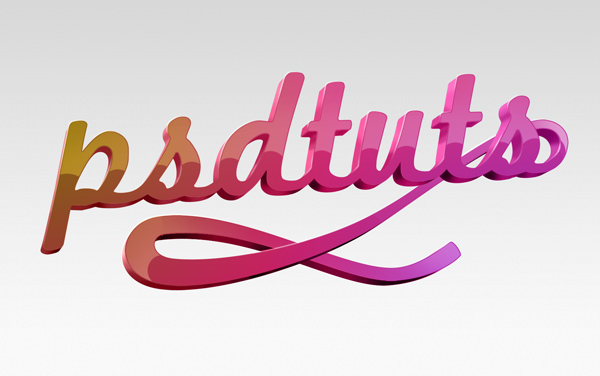
OK at this stage this is how your image, and your layers should look.

Step 18

Now go back to group "1" and duplicate "base 1" by dragging it to the New Layer button at the bottom of the layers palette.
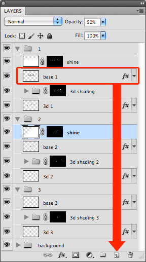
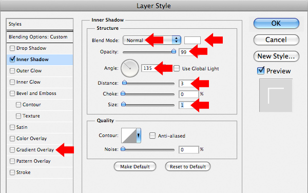
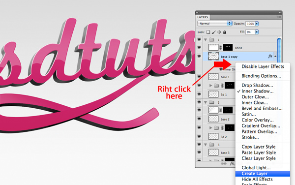
Open the Layer Styles window for this duplicate layer by double clicking on Gradient Overlay Effect. In the Layer Style window, uncheck the Gradient Overlay and add an Inner Shadow with the following settings.
Right click on the effect itself in the Layers Palette and go to Create Layer. This will separate the effect from the layer, so it will cease to be a layer style and will be a pixel image on a layer of its own. Name this layer "highlight 1."
Now you can delete the "base 1 copy" layer. Nudge "highlight 1" 1px left by pressing the left arrow key, then Cmd/Ctrl + Click on the thumbnail of "base 1" and apply that selection to "highlight 1" as a layer mask by pressing the Add Layer Mask button at the bottom of the Layers Palette.
The with the layer mask in place, nudge the layer 1px up and 2px left using your arrow keys. This is to position the highlight right over the corner of our lettering – where the light would be reflecting from. You should now have something like this.

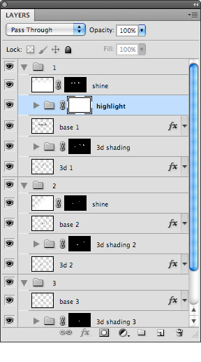
Group the "highlight 1" layer (Cmd/Ctrl + G) and name the group "highlight". Give the group a Layer Mask by clicking on the Layer Mask button. We could work on "highlight 1"s layer mask, but this way it will be easier to correct errors and fine-tune the mask.
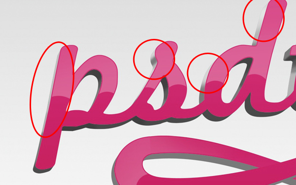
With the layer mask selected, using a medium soft, black brush, mask out areas of the highlight folder. Mask any areas that are not on a top-left edge. Here’s how it should look.

Step 19

Repeat this last step for groups "2" and "3" – duplicating the "base" layers, applying the Inner Shadow, then creating a layer from the style then masking it necessary.
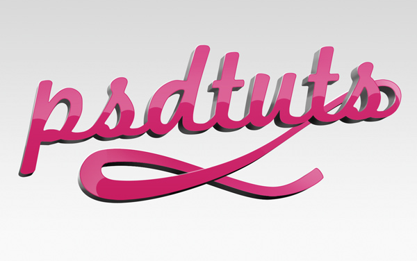
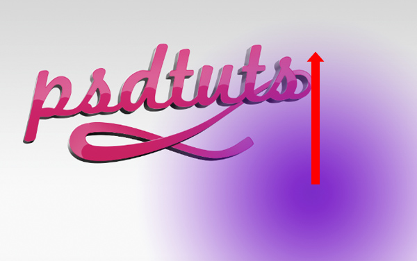
OK, we’re getting there, now we want to add some more colors. Create a new folder at the very top of all our layers/groups, and name it "color overlay". Create a new layer within this new group and call it "overlay 1". Set your foreground color to #7c21c8 and select the Gradient Tool (G) with a foreground to transparent, circular gradient. Add a large radial gradient in the bottom right corner, and then set the layer Blend Mode to Color.

Step 20

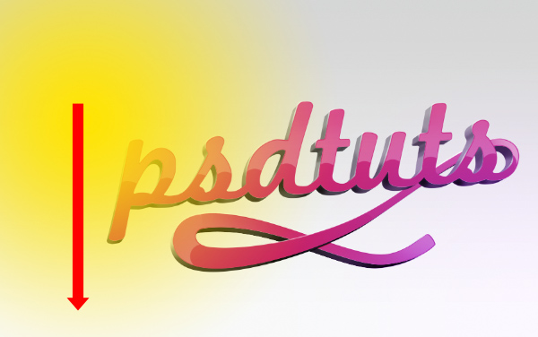
Now create a new layer called “overlay 2″ and draw another gradient in the top right corner with the color #fee409. Again switch the Blend Mode to Color.
Step 21

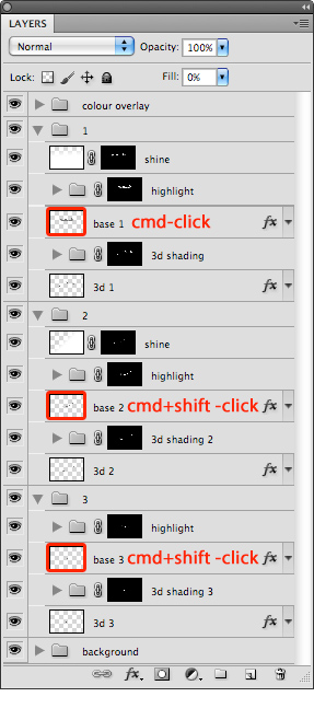
Now we want to load a selection that includes all our "base" layers. We do this by Cmd/Ctrl + clicking on "base 1", Cmd/Ctrl + Shift-clicking on "base 2" and Cmd/Ctrl + shift-clicking on "base 3".
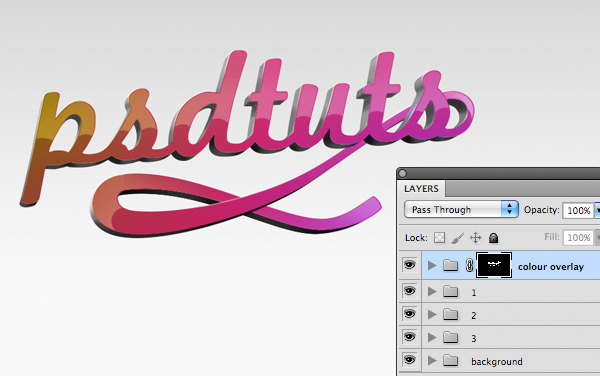
Now apply this selection as a layer mask to the group “color overlay” by clicking on the Add Layer Mask button.

Step 22

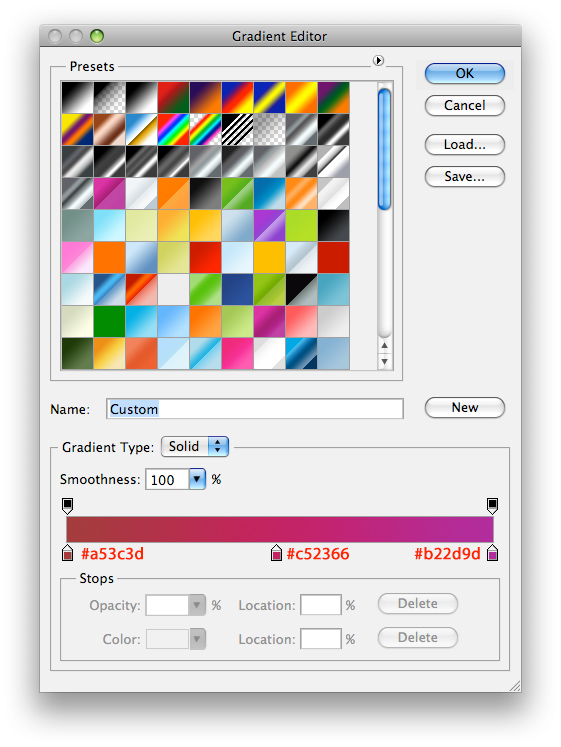
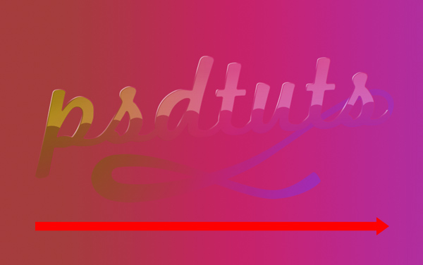
Now we’re going to add color to the "3d" layers. Create a new layer within the group "1", name the new layer "color 1" and place it directly above the group "3d shading 1". Select the Gradient Tool and create a three-color gradient using colors #a53c3d, #c52366 and #b22d9d. On the new layer, draw a linear gradient across the length of our image and change "color 1"s Blend Mode to Color.
Step 23

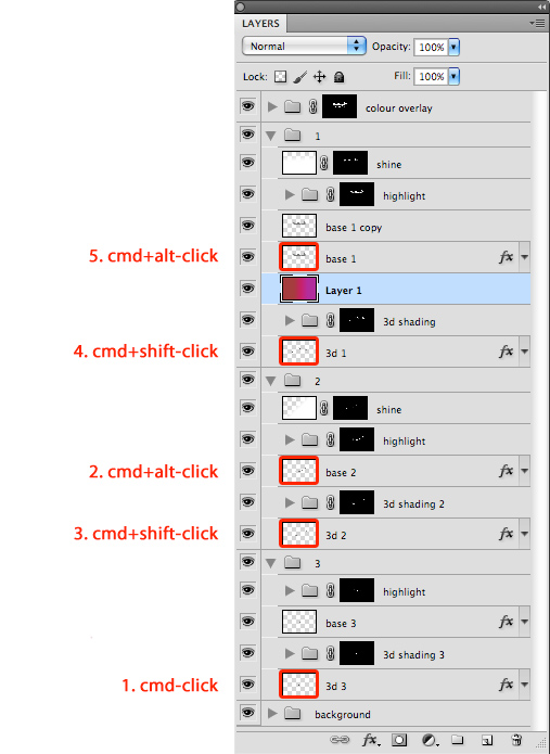
Now we want to mask this new gradient layer in the shape of our "3d" layers, minus the shape of some of our "base" layers. This might seem a complex series of clicks but its necessary to get the right selection, so it’s important that you follow these clicks correctly, and remember, you need to click the layer thumbnail, not the full layer.
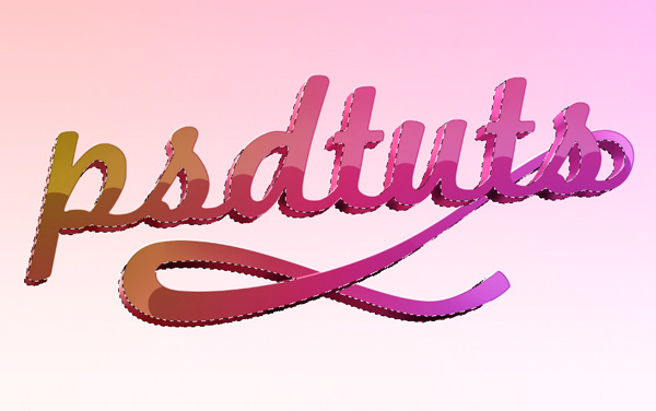
First, Cmd/Ctrl + click on "3d 3", then Cmd/Ctrl + alt-click on "base 2", Cmd/Ctrl + Shift-click on "3d 2", then Cmd/Ctrl + Shift-click on "3d 1", finally Cmd/Ctrl + Alt-click on "base 1". When you’ve got the selection, apply it as a layer mask to "color 1".
Step 24

Next, create a new layer inside of, and at the top of group "2" and name it "shadow". Cmd/Ctrl + click the thumbnail of "base 2" and Cmd/Ctrl + shift-click the thumbnail of "3d 2" and apply that selection as a mask to "shadow" layer. On that layer, with a medium, soft, brush set to 30% Opacity black, paint in a small shadow where the top of our swirl disappears behind the text. This will create the illusion of distance between those two elements.
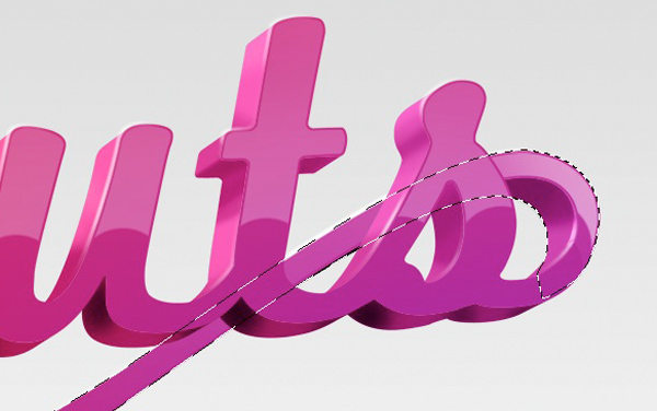
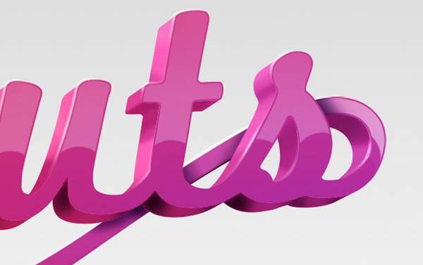
Now we need to do the same thing further down the swirl where it overlaps itself. Create a new layer inside of, and on top of group "3" and name it "shadow 2". Cmd/Ctrl + click the thumbnail of "base 3" the Cmd/Ctrl + Shift-click the thumbnail of "3d 3" to load the selection and then apply it as a mask to "shadow 2". With a medium, soft brush set to 30% black, paint in a small shadow on the swirl that’s beneath.

Step 25

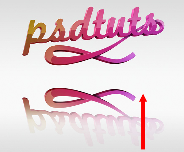
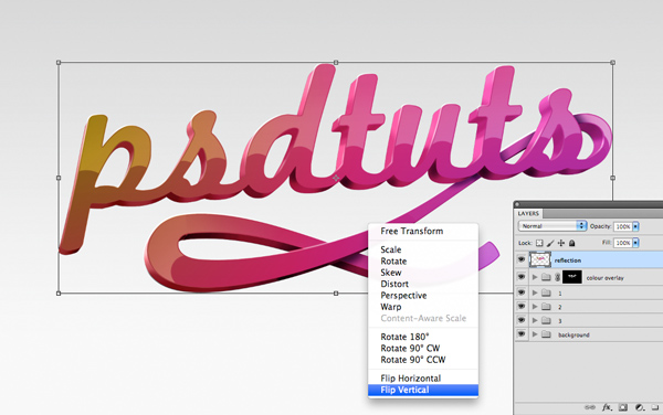
OK we’ve just about finished now, just a small shadow and reflection left to add. If you collapse all your folders now, you should be left with five main groups. Select all of them apart from "background" and drag them to the New Layer button to duplicate them. With all the duplicate folders selected hit Cmd/Ctrl + E to merge them into one layer, name this layer "reflection". Free Transform this layer (Cmd/Ctrl + T) then right click > Flip Vertical. Move this layer down the page and add a layer mask.
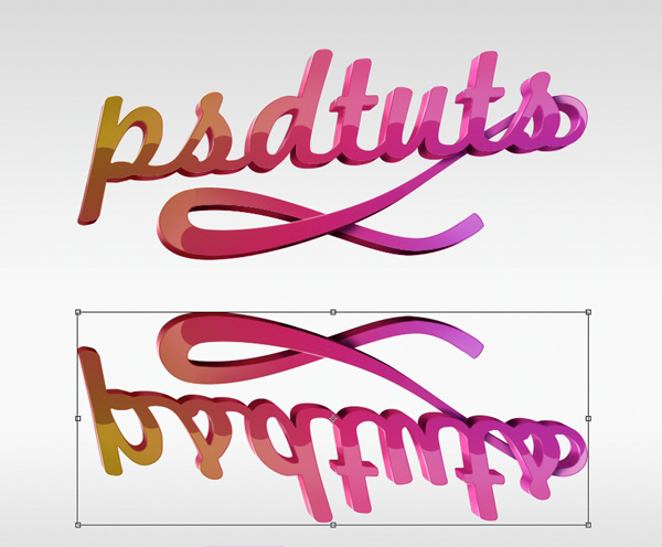
With black and white as your foreground and background colors, draw a foreground to background linear gradient on the mask, from the bottom of your reflection to the top, then switch the layer Opacity down to 10%.

Step 26

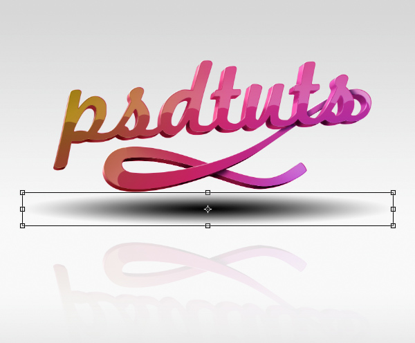
Finally, create a new layer, just above our “background” group and name it “shadow”. With black as your foreground color, select the Gradient Tool (G) choose a radial gradient and draw a large foreground to transparent gradient in the middle of our image.
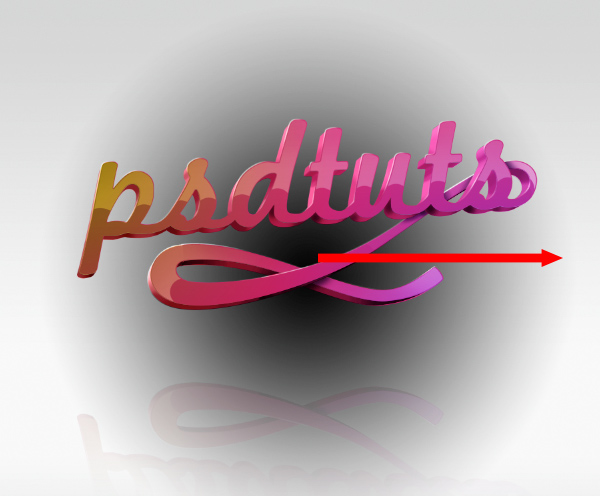
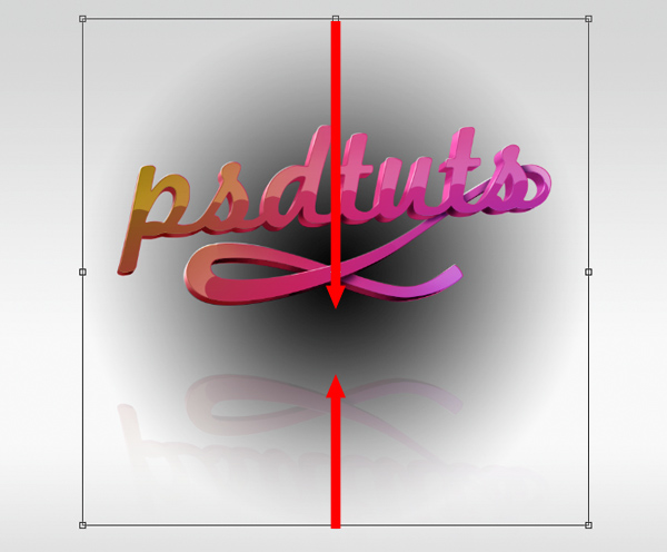
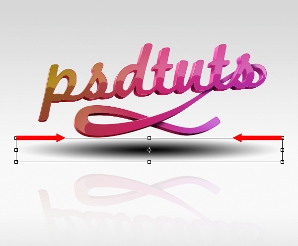
Free Transform this layer (Cmd/Ctrl + T) and drag it with the top and bottom anchors to reduce its height as shown
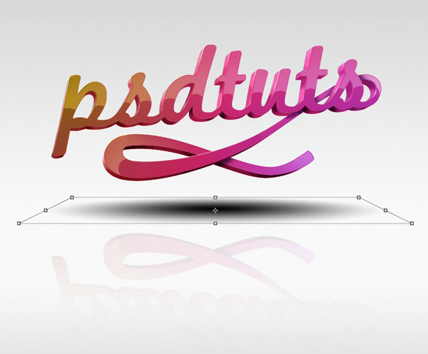
Before you release the Free Transform, right click and select Perspective. Drag the top right anchor in towards the left (the left will mirror this) and press return.

Conclusion

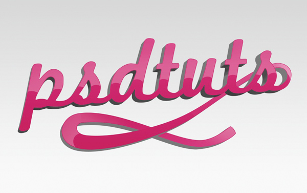
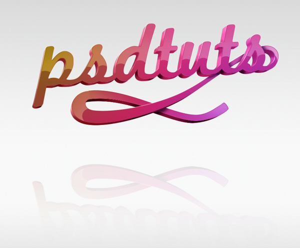
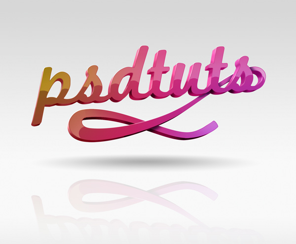
Turn the layer Opacity down to 30% and thats it!
Comments

Popular posts from this blog

Use x-ray techniques in Photoshop to show naked skin through clothing

    Do those new naked body scanners have you freaked out at the airports? As far as the TSA is concerned, those x-ray machines are here to stay, but you might as well take comfort in knowing that airport security guards aren't the only ones looking at your private parts. Practically anyone with a computer can manage to see through your clothes, and it's all thanks to a little program called Photoshop. Thanks, Adobe. With a few tweaks using the tools in Photoshop, you can see those boobs in no time, male or female. The video is in German, but it's not hard to figure our what's going on, especially if you're familiar with Photoshop. First, create a few duplicate layers, then get a handle on some of these tools to make the naked body through the clothes: * Auswahl erstellen (Create Selection) * Tonwertspreizung (Input Levels) * Belichtung (Exposure) You can also do this see-through clothing effect in free design programs, such as  GIMP .

40 latest creative photoshop text effects

Create a Glowing Liquid Text with Water Splash Effect in Photoshop In this tutorial, we will show you the steps we took to create a Glowing Liquid Text Effect in Photoshop. We will be practising the use of liquify filter, layer blending options, as well as some image adjustments. Create a Realistic Wooden 3D Text Image In this tutorial we are going to take a few 2D textures as well as a few Photoshop techniques to create a realistic 3D text image. Easy X-Ray Typography In Photoshop In this tutorial we will show you how to create a simple x-ray effect of a letter, in this case the Abduzeedo logo A. The whole process is quite simple but it will require a couple of hours to pull it off. Easy Furry Text In Photoshop In this tutorial we will show you how to create a really cool and super simple furry text in Photoshop CS6. We will use basic filters and tools but it’s nice to say that we took advantage of the a new feature in Photoshop CS6 that is to apply layer

150 + Ultimate Round-Up of Illustrator Tutorials

01. Learn Illustrator CS3 in 30 Days Tutorial Link 02. A Comprehensive Guide: Illustrator’s Paintbrush Tool and Brush Panel Tutorial Link 03. Illustrator’s Pen Tool: The Comprehensive Guide Tutorial Link 04. Utilizing the Magic Wand’s Tolerance Levels Tutorial Link 05. Illustrator Live Trace Tutorial Link 06. Adobe Illustrator CS3 Tutorial: Selection Tools Tutorial Link 07. Spraying Symbols in Adobe Illustrator Tutorial Link 08. Duplicate with rotate tool Tutorial Link 09. An Intro to the Mesh Tool Tutorial Link 10. Illustrator Make with Mesh Tutorial Link 11. Tips for Working with the Gradient Mesh Tool In Illustrator Tutorial Link 12. Spiral Tool Mysteries – Solved! Tutorial Link 13. Using the Pathfinder and Align tool in Illustrator Tutorial Link 14. How to Make a Custom Illustrator Brush Tutorial Link 15. Get More-Natural Adjustments with the Illustrator “Reshape” Tool Tutorial Link 16. Fun