
PHOTOSHOP LEVELS TOOLS

PHOTOSHOP LEVELS TOOLS

Levels is a tool in Photoshop and other image editing programs which can move and stretch the brightness levels of an image histogram. It has the power to adjust brightness, contrast, and tonal range by specifying the location of complete black, complete white, and midtones in a histogram. Since every photo's histogram is unique, there is no single way to adjust the levels for all your photos. A proper understanding of how to adjust the levels of an image histogram will help you better represent tones in the final image.

HOW IT WORKS

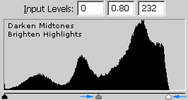
The levels tool can move and stretch brightness levels in a histogram using three main components: a black point, white point and midtone slider. The position of the black and white point sliders redefine the histogram's "Input Levels" so they are mapped to the "Output Levels" (default is black (0) or white (255), respectively), whereas the midtone slider redefines the location of middle gray (128). Each slider is shown below as they appear in Photoshop's levels tool, with added blue labels for clarity:
Levels in Photoshop
All examples below will use the levels tool on an RGB histogram, although levels can also be performed on other types of histograms. Levels can be performed on an individual color channel by changing the options within the "Channel" box at the top.

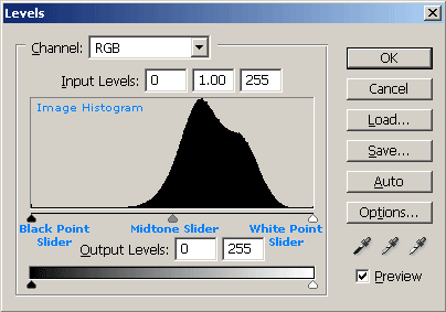
ADJUSTING THE BLACK AND WHITE POINT LEVELS

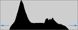
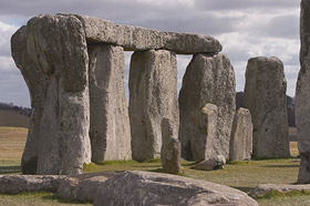
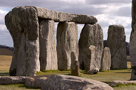
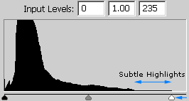
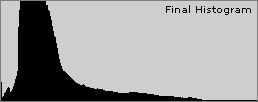
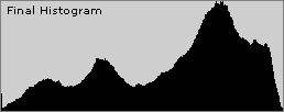
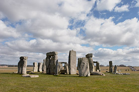
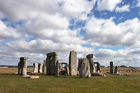
When considering adjusting the black and white point levels of your histogram, ask yourself: is there any region in the image which should be completely black or white, and does the image histogram show this?
Most images look best when they utilize the full range dark to light which can be displayed on your screen or in a print. This means that it is often best to perform levels such that the histogram extends all the way from black (0) to white (255). Images which do not extend to fill the entire tonal range often look washed out and can lack impact. The image below was taken in direct sunlight and includes both bright clouds and dark stone shadows — an example of where there should be at least some regions that are portrayed as nearly white or black. This histogram can be extended to fill the entire tonal range by adjusting the levels sliders as shown:
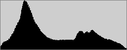

Histogram Before Levels Histogram After Levels
Lower Contrast Higher Contrast
On the other hand, be wary of developing a habit of simply pushing the black and white point sliders to the edges of the histogram — without also paying attention to the content of your image. Images taken in fog, haze or very soft light often never have fully black or white regions. Adjusting levels for such images can ruin the mood and make your image less representative of the actual scene by making it appear as though the lighting is harsher than it actually was.
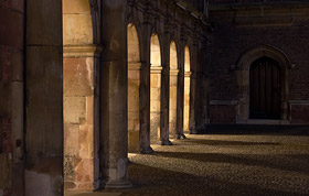
One should also be cautious when moving the black and white point sliders to the edge of the histogram, as these can easily clip the shadows and highlights. A histogram may contain highlights or shadows that are shown with a height of just one pixel, and these are easily clipped. This is often the case with low-key images (see histograms tutorial), such as the example shown below:

Histogram Before Levels Histogram After Levels
No Pixel at Full Brightness Stronger Highlights
Holding down the "ALT" key while dragging the black or white point slider is a trick which can help avoid shadow or highlight clipping, respectively. If I were to have dragged the highlight slider above to a point which was further left (a level of 180 was used, versus 235 above), while simultaneously holding down ALT, the image would have appeared as follows:
If the image is fully black while dragging a black or white point slider, then no clipping has occurred. When the slider is dragged over where there are counts on the histogram, the regions of the image which have become clipped get highlighted as shown above. This can be quite useful because knowing where the clipping will occur can help one assess whether this will actually be detrimental to the artistic intent of the image. Keep in mind though that clipping shown while dragging a slider on an RGB histogram does not necessarily mean that region has become completely white — only that at least one of the red, green, or blue color channels has reached its maximum of 255.

ADJUSTING THE MIDTONE LEVEL

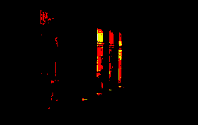
Moving the midtones slider compresses or stretches the tones to the left or right of the slider, depending on which direction it is moved. Movement to the left stretches the histogram to the its right and compresses the histogram to its left (thereby brightening the image by stretching out the shadows and compressing the highlights), whereas movement to the right performs the opposite. Therefore, the midtone slider's main use is to brighten or darken the midtones within an image.
When else should one use the midtone slider? Consider the following scenario: your image should contain full black and white, and even though the histogram extends to full black, it does not extend to white. If you move the white point slider so that it reaches the edge of the histogram, you end up making the image much brighter and overexposed. Using the midtone slider in conjunction with the white point slider can help you maintain the brightness in the rest of your image, while still stretching the highlights to white:

Histogram Before Levels Histogram After Levels
Sky Not At Full Brightness Stronger Highlights
Similar Overall Brightness
Note how the sky became more pronounced, even though the overall brightness of the image remained similar. If the midtones tool were not used, the image to the right would have appeared very overexposed. The same method could be used to darken the shadows while maintaining midtones, except the midtones slider would instead be moved to the left.
Note: Even though the midtones slider is always initially at 128, it is instead shown as 1.00 to avoid confusion when the black and white points change. This way, the midtones slider is always at 1.00 even when the other sliders have been moved. The midtone "Input Level" number actually represents the gamma adjustment, which can be thought of as a relative measure of the number of levels on the sliders left to those on its right. Thus, values greater than one mean there are more levels are to the slider's right, whereas values less than one mean more levels are to its left.

ADJUSTING LEVELS WITH THE DROPPER TOOLS

The histogram levels can also be adjusted using the dropper tools, shown below in red:
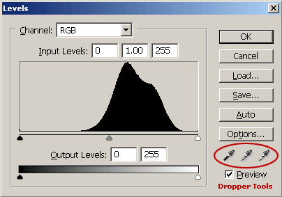
Location of the Dropper Tools in Photoshop

Comments

Popular posts from this blog

Use x-ray techniques in Photoshop to show naked skin through clothing

    Do those new naked body scanners have you freaked out at the airports? As far as the TSA is concerned, those x-ray machines are here to stay, but you might as well take comfort in knowing that airport security guards aren't the only ones looking at your private parts. Practically anyone with a computer can manage to see through your clothes, and it's all thanks to a little program called Photoshop. Thanks, Adobe. With a few tweaks using the tools in Photoshop, you can see those boobs in no time, male or female. The video is in German, but it's not hard to figure our what's going on, especially if you're familiar with Photoshop. First, create a few duplicate layers, then get a handle on some of these tools to make the naked body through the clothes: * Auswahl erstellen (Create Selection) * Tonwertspreizung (Input Levels) * Belichtung (Exposure) You can also do this see-through clothing effect in free design programs, such as  GIMP .

Photoshop Photo Effects Tutorials 2024

  Photoshop Photo Effects Tutorials Everyone loves Photoshop effects. Not only are photo effects fun to create, but they’re a great way to learn Photoshop since they often introduce us to tools, commands or other features we might otherwise never know about! All of our Photoshop effects tutorials are written with beginners in mind, with easy-to-follow, step-by-step instructions. See our complete list below, or download our tutorials as  print-ready PDFs ! Fade an Image to Color in Photoshop Faster with Live Gradients Learn how to fade an image to color with Photoshop the new and easy way using live gradients! How to Add Falling Snow to Photos with Photoshop Learn how to add realistic falling snow to your winter photos with Photoshop. Get Better Color Halftone Effects in Photoshop Learn how to create more realistic color halftone patterns using Photoshop’s Color Halftone filter and this simple trick. How to Create a Halftone Dot Pattern in Photoshop Learn how to turn your photo into a h

Ridiculously Cool Photoshop Text Effect Tutorials

  Easy Photoshop Text Tutorials for Beginners If you’re still learning the fundamentals of design or want some quick-and-easy text ideas to jazz up your print designs, these beginner tutorials will be a big asset. In your lessons you’ll learn how to apply texture and 3D effects, create logos, utilize masks and other simple techniques for enhancing your text. 1.  Using Text As A Container For More Text In Photoshop 2.  Glossy Emblem Text Effects 3.  Create a Realistic Emboss/Deboss Effect 4.  Icy Styles in Photoshop 5.  How To Create a Gold Text Effect in Photoshop 6. Moon Shine Text Effect 7. Simple Styled Text with Stars Effect 8.  Elegant Glossy Gold Text Effect 9.  Hipster Text Effect in Photoshop CS6 10.  The Sugar Bag Effect 11.  Easy Chalk Ornament Typography in Photoshop 12.  Abstract Shining Text Effect with Groovy Font 13.  Easy Plastic Text with Layer Styles In Photoshop 14.  Papercraft Text Effect 15.  Making a Clipping Mask With Text In Photoshop 16.  Simple Bokeh Text Effe