
Design a Cartoon Grunge Web Site Layout
Final Product What You'll Be Creating

Step 1
Create a new Web document at 1024px by 768px. Fill the background with a color similar to the image below. Grab the Rectangle Tool and draw a rectangle. The rectangle should fill about half of the page with the color given below. Then Rasterize it. Go to Layer>Rasterize>Shape.Rename this as “top layer.” Using the Lasso Tool, draw shapes across the bottom of the rectangle, like in the image below. Then press Delete. This will cut out the shapes from the rectangle. This is a quick way to create this. Of course, you could use a mask, if you prefer.
Step 2
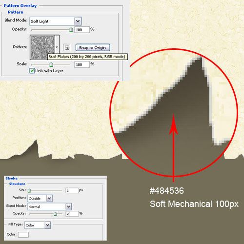
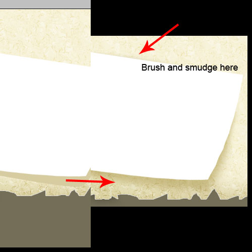
Create a new layer below the “top layer.” Grab the Brush Tool. Set it to Soft Mechanical, 100px Diameter, and (#484536) color. Use the Brush to create the shape of the shadow for the “top-shadow” layer. You may need to zoom in and smudge it to get a better result.Next we apply some layer styles. Apply a 1px outside white stroke to the top layer. Then apply Pattern Overlay, with Soft Light Blend Mode, and use Rust Flakes for the pattern.
Tips: It’s best to draw the shadow yourself. Try to make the shadow not fixed, as it may make it look unnatural. You may need to spend some time to draw this part to make it look good.
Step 3
Create a layer above the “top layer.” Then Option/Alt-click between the layers to create a mask. With the same Brush, set the color to (#d8ce9d). Then brush along the edge of the “top layer” to create a highlight.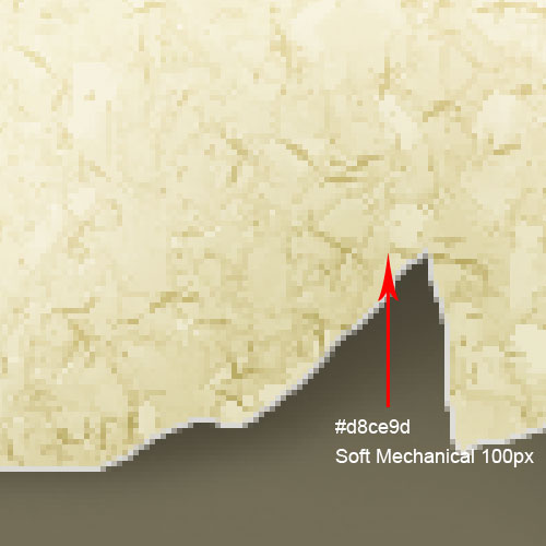
Step 4
Create a rectangle by going to Edit>Free Transform or Cmd/Ctrl+T. Then Rotate to the angle shown below. Use Cmd/Ctrl+T again and this time select Warp. Drag the bottom right corner as shown below.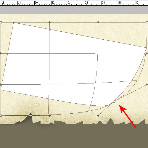
Step 5
Using the Pen Tool, draw out the shadow below the rectangle shape. Apply Gaussian Blur at 5px. Then set the layer blend mode to Multiply.Tips: Brush out the little shadow at the top to enhance the effect.
Step 6
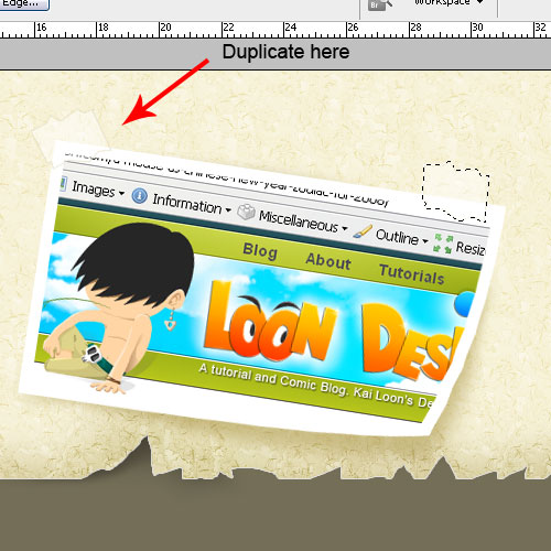
First, Cmd/Ctrl-click on the rectangle to bring out the selection. Go to Select>Modify>Contract>10px. Create a new layer above it and fill it with a white color. Next place any photo you like. Then create a mask with the new layer we just created.Use the Polygonal Lasso Tool to draw the tape. Then create a new layer above and fill it with a white color. Then set the Fill to 47%. Apply a 1px Inside Stroke, (#e4dec3) color, and set the Opacity to 66%. Then duplicate it. Move the duplicate to the left, then rotate the left tape, as in the image below.
Step 7
Use the Brush Tool (B) to create the shadow for both pieces of tape. See the settings below.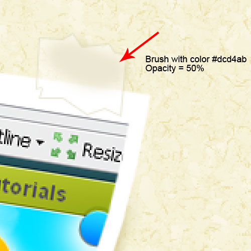
Step 8
Type the site title. I am using Bernard MT Condensed, with (#7a745e) color, and 72px size. Type out the primary navigation titles next. Then Rasterize the type. Grab the Erase Tool(E), and with the TB_Grunge Brush, randomly erase the letters to make a worn effect. Or if you prefer a nondestructive method, then use a mask to create these effects.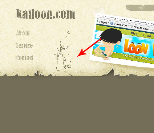
Step 9
Using the Pencil Tool(B), zoom in, and draw an arrow shape. Then erase it, as we did with the titles we made in the previous step.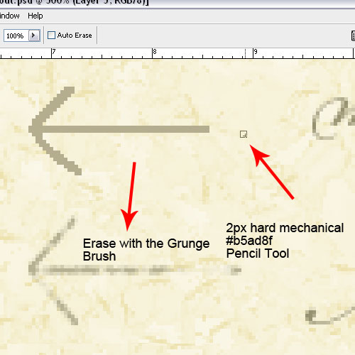
Step 10
Using the same technique, create the Search Input field, then the RSS icon. I also added some text next to our main navigation titles.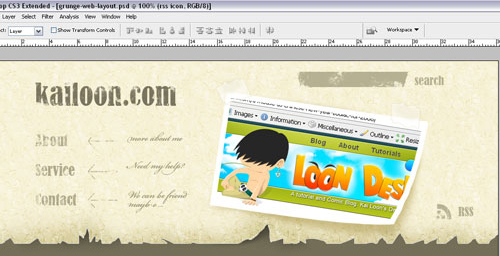
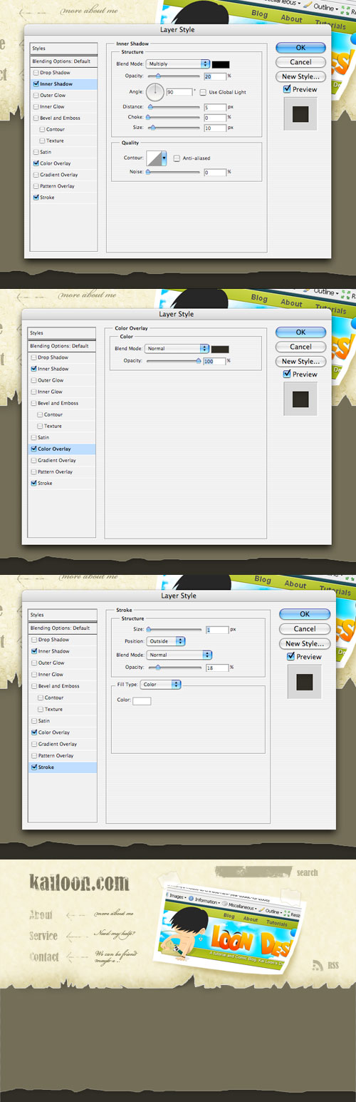
Step 11
Our “header” is done. We already have our “main body” area colored in as our background, so let’s make our “footer” next.Grab the Rectangle Tool and draw a rectangle at the bottom of the screen about 40px high. Give it a color of (#302e26). Then Rasterize it. Go to Layer>Rasterize>Shape. Then use the same cutting technique that we used to create the “top layer.” Only this time, we’ll be doing this to the top of the rectangle. Go ahead and cut some shapes out of the top of the rectangle. Then apply the layer styles below. Your end result for this step should look like the last image below.
Final Image
We are almost done now. For the final image, simply add in three white rectangles. Then apply a Drop Shadow layer-style effect. Add in three images of your choice. Mask them to fit within the boundaries of the white rectangles. Our final image is below.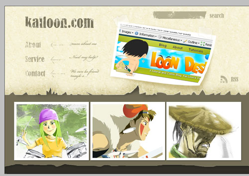
Comments
Post a Comment