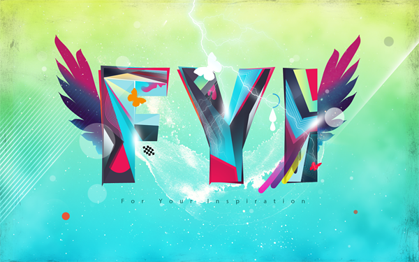
Step 1 : Creating and Tweaking the Text
First We need to
prepare the text to work with. Open up Illustrator. Type in the letters.
Choose a bold typeface. I used Futura Extra Bold Condensed.
Ok,
now the text is in. We are not going to use as it is. We need to give
it a little personal touch by tweaking the letters. We have to break the
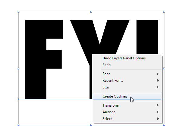
text in order to edit it. Right click on the text and choose “Create
Outlines” or Press
Ctrl+Shift+O to create outlines of the text. Now ungroup the text by hitting
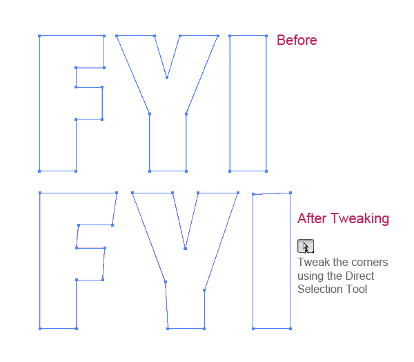
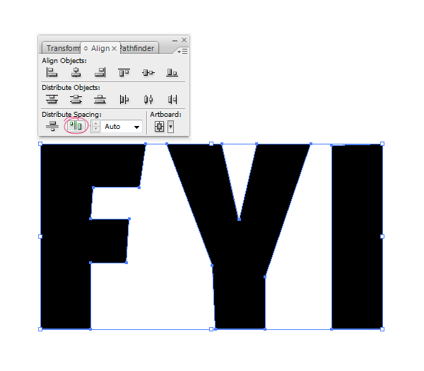
Ctrl+Shift+U. Tweak the edges using Direct Selection Tool.
Use the Align Palette to distribute the distance between letters equally.
Step 2 : Creating the Document and Bringing the Text
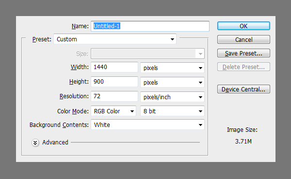
Before we start designing, we need to plan out the requirements
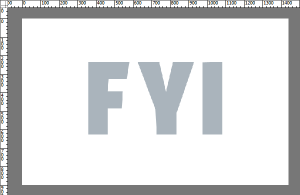
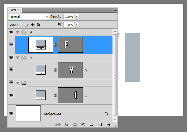
Copy and Paste the text from Illustrator. Choose Shape Layer option when pasting.
Now
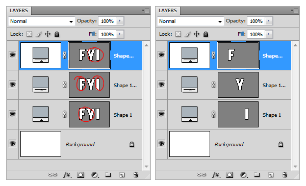
we need to separate the letters. To do this duplicate the main shape
layer a couple of times. Select the Path Selection Tool, select the
letters we don’t need from each layer and delete them.
Create 3 groups to contain the letters.
Step 3 : Line Work and Creating Pieces.
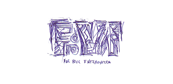
I
have done a sketch of the design according to my idea. Not very
detailed, it is actually a thumbnail sketch but it gave me the start I
was looking for. Ideas often tend to be abstract, surreal and partly
defined. Sketching is a great way to improve the perception of ideas.
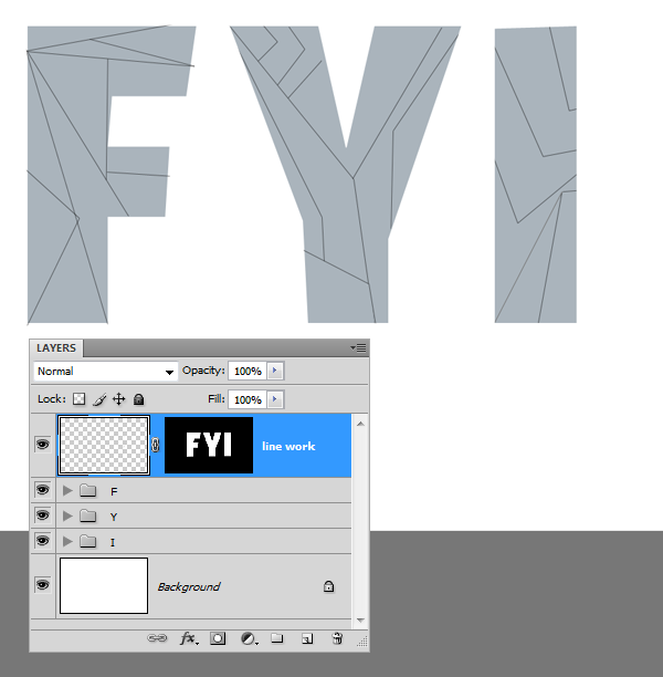
Create
a new layer above the letters. Based on the idea from initial thumbnail
sketch I have constructed the text outlines. Use the Line Tool to
create the lines. The idea is to fill the segments with lot colors and
values.
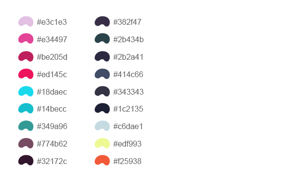
Here
is a sample color palette that I picked. This is just to give you an
idea, however you are not forced to use the exact same values it depends
on your taste and intuition. But this is more or less what I have used
in this design.
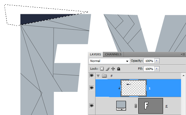
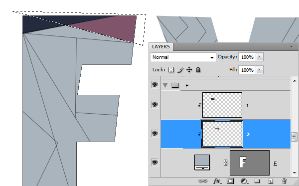
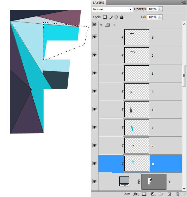
We have the line work made. We need to fill in the colors between the lines. Create a new layer above the
“F”layer. Then Clip this layer to the letter (
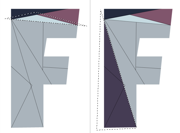
Ctrl+Alt+G). Make selection for each segment using the Polygonal Lasso Tool and fill the color.
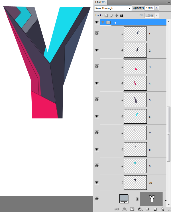
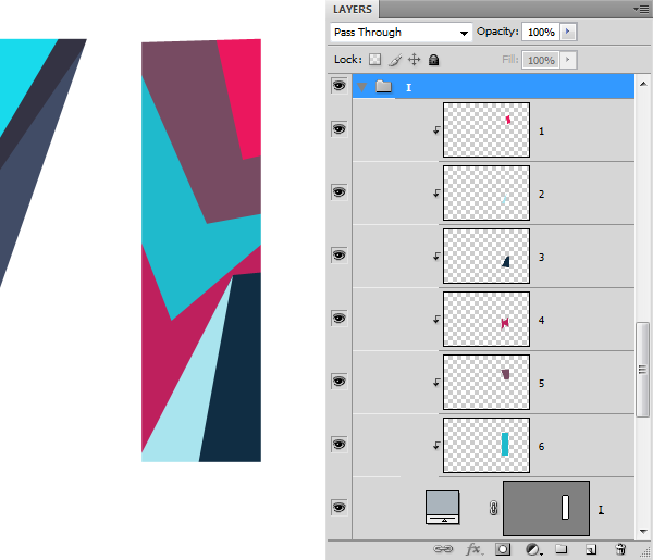
Repeat
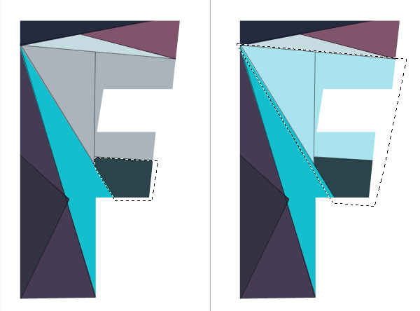
the process. This is going to be a two fold process. First time we need
to get every single segment filled and have them on separate layers.
Then we work around each character and make them more vivid and bright. A
thing about layer order, Don’t get confused with so many layers.
Proceed with it anyway that makes sense to you and as long as it works.
Repeat the process to complete the remaining letters.
Step 4 : Adding More Details and Colors
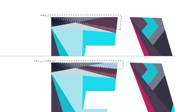
Here we have the solid color version of the design. Let’s see what we can to improve it.
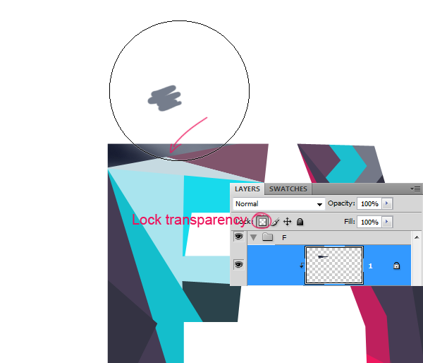
We
will apply different shades to the pieces. We can do this using the
Brush Tool and isolating the transparent pixels of the layer. Check the
Lock Transparent Pixels option on the Layers palette. This will limit
the brush strokes to the existing pixels.
Then I added some more segments.




Comments
Post a Comment